Andre Poremski

Product executiveLeadership through design

Design can change what we’re willing to accept and what we believe is possible. My work is about giving people the means to challenge the compromises we’ve normalized and create better ways to live.

  1. People first. At IWBI, I’m bringing brand and product together to make caring for people the foundation of how we shape our places.

  2. The curious. I founded Fieldguide to turn people’s curiosity about nature into a shared understanding of it.

  3. A movement. At USGBC, I helped give green building an identity people could believe in and make their own.

← BackIWBI
The WELL seal: the word WELL inside broken concentric rings

Head of Design​2022–Present

International WELL Building Institute

People first. The places we share shape our health and well-being. At IWBI, I’m bringing together what I’ve learned about building a movement and building useful tools to help people act on that knowledge. I lead design across brand and product, shaping One WELL into a coherent standard and experience that helps individuals and organizations put the science into practice. The ambition is to make caring for people part of how places are designed, operated and improved.

I lead design across brand and product, working with internal teams and studio partners credited below.

01

The mark

The original International WELL Building Institute seal The previous WELL seal The current WELL seal

One mark. As WELL grew, its identity needed to bring an expanding family of programs together. We simplified the institute’s seal to its rings and the WELL name, giving the organization a clearer presence and its programs a shared point of recognition.

Certification

WELL Certified seal: BronzeWELL Certified seal: SilverWELL Certified seal: GoldWELL Certified seal: Platinum

Ratings

WELL rating seal: Health-SafetyWELL rating seal: OperationsWELL rating seal: PerformanceWELL rating seal: EquityWELL rating seal: CoworkingWELL rating seal: WorkforceWELL rating seal: InteriorsWELL rating seal: Real EstateWELL rating seal: Residential
02

One WELL

Knowledge into action. The science behind healthier places can only make a difference when people can apply it. One WELL brings WELL’s programs into an integrated standard, with a shared experience that helps people understand what applies to them and how to move forward. The landing page introduces that change, makes its value clear and invites people into the standard.

The One WELL landing page: a first look at the next version of WELL, four changes, a tour, the vision and the roadmap

The promiseAn integrated standard that is easier to understand, implement and scale.

The changesHarmonized, clarified, evergreen and smarter, brought to life through concise explanations and animation.

The tourA guided introduction to the structure and content of the new standard.

The visionOne standard. One experience. One WELL.

The roadmapA phased path from public comment to enrollment and continued improvement.

Harmonized
Clarified
Evergreen
Smarter

Visit standard.wearewell.com ↗

03

The system

Care in the details. A clear experience depends on hundreds of small decisions working together. WELL Design gives our products a shared foundation of typography, components and interaction patterns. It helps people carry what they’ve learned from one part of WELL to another, and gives our teams a consistent way to build.
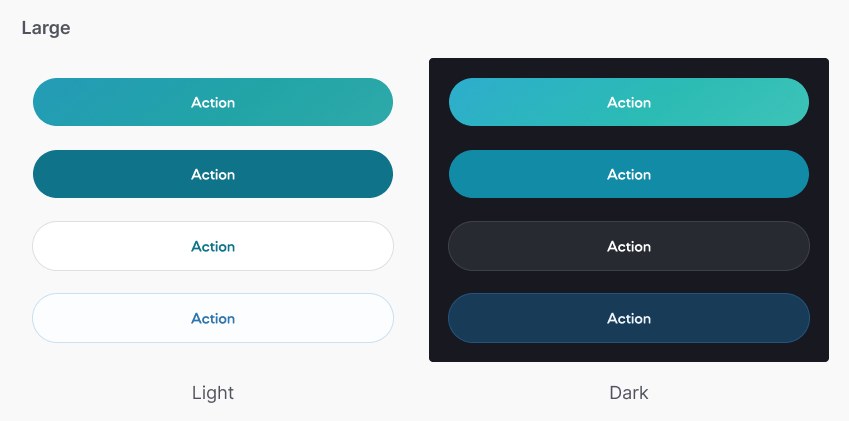
Pill buttons in four styles, on light and on dark
Buttons
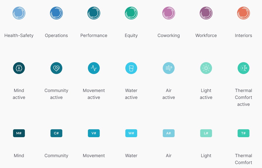
Three rows of badges: round rating badges in seven colors, round concept icons, and small colored theme codes
Badges: ratings, concepts and theme codes
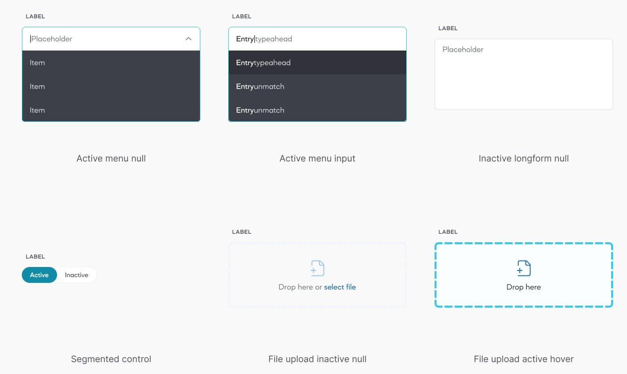
An open menu, a type-ahead menu, a long text field, a segmented control and two file upload areas
Fields: menus, long text, segmented controls and file uploads
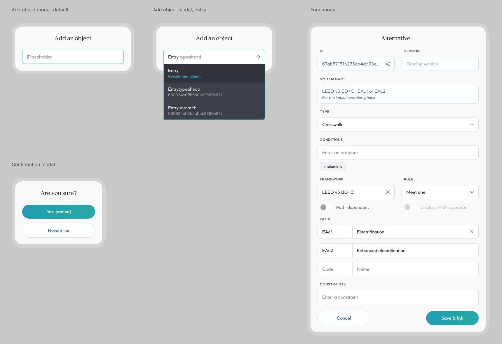
Three small modals and one long form modal on a gray ground
Modals
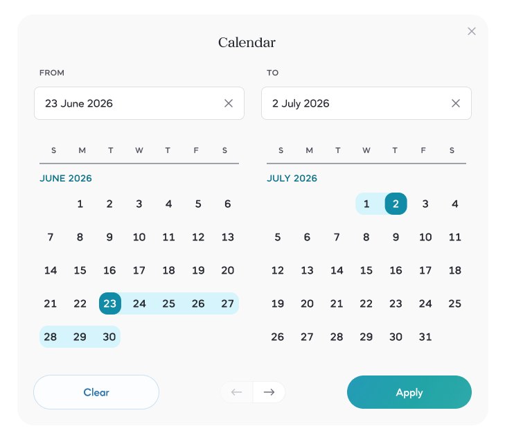
A two-month calendar with a date range selected from 23 June to 2 July
Calendar and date-range selection
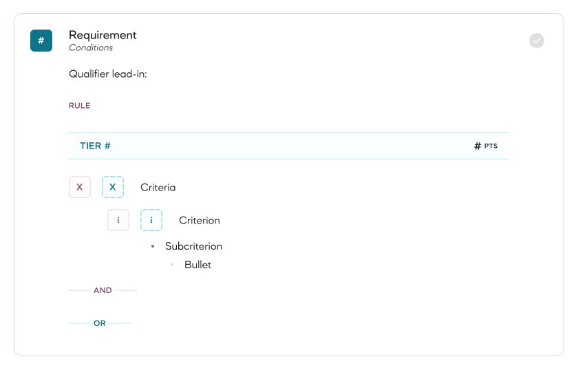
A requirement card with a rule, a tier row, criteria and sub-criteria
Requirement block
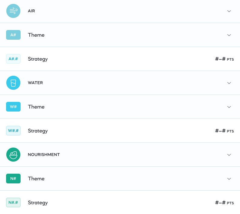
A list of rows for the WELL concepts Air, Water and Nourishment, each with a theme row and a strategy row
Standard navigation: concept, theme and strategy
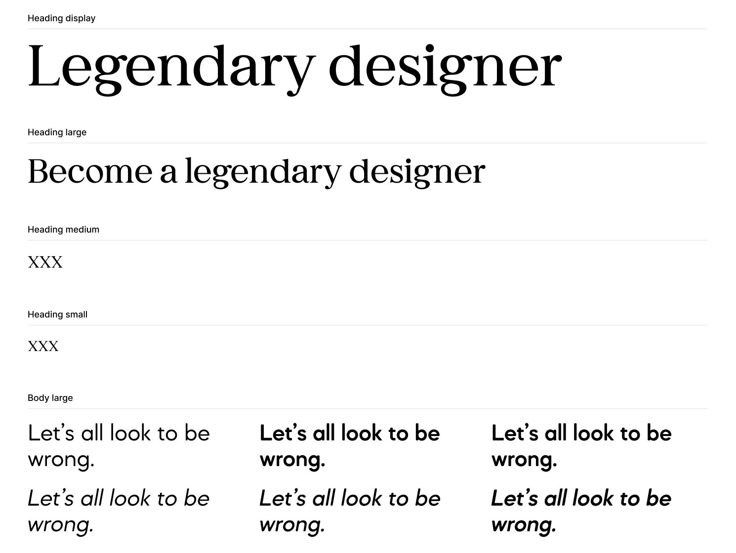
Type scale for decks: serif headings and a geometric sans for body text
Typography: transitional serif headings and geometric sans-serif body text
04

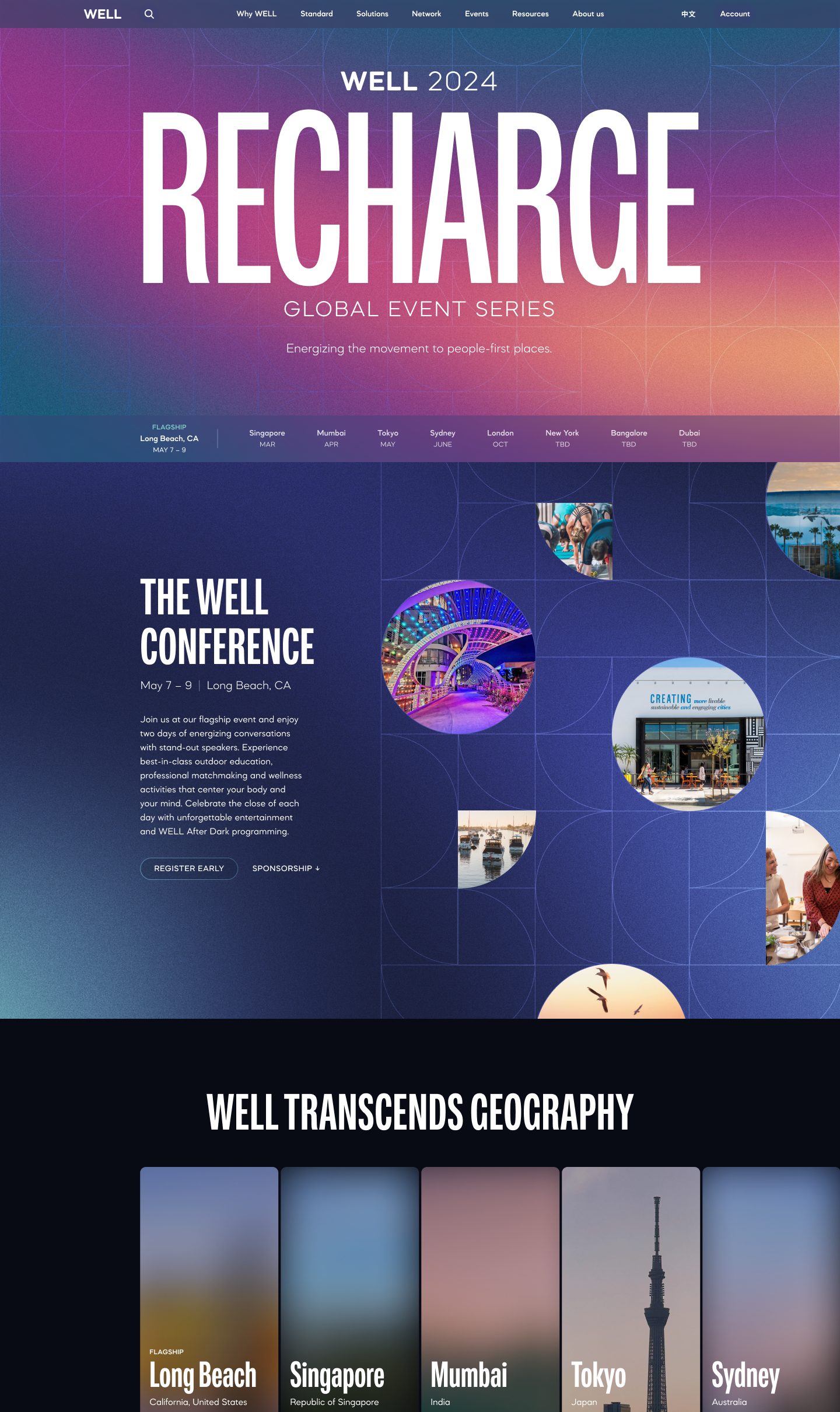
WELL 2024​Recharge

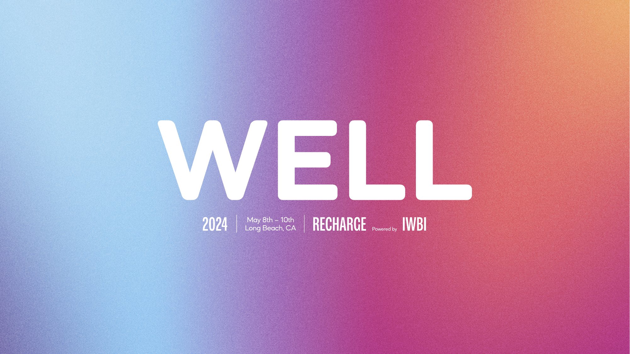
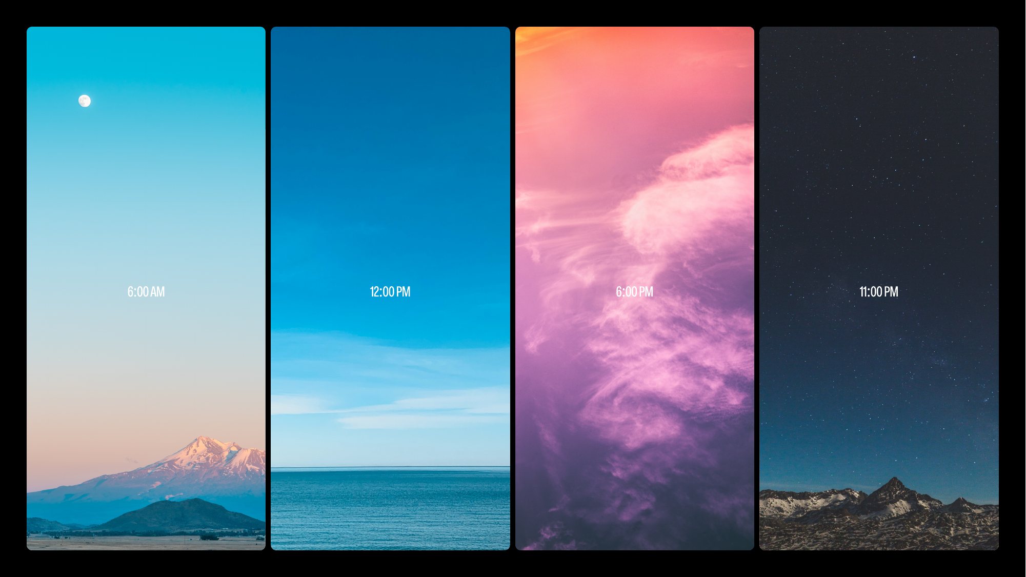
A place to gather. For WELL’s first conference, we created an identity around the changing light of a single day. From sunrise to night, the palette gave the event a sense of rhythm and renewal, carrying across the website, printed materials, wayfinding and stage.
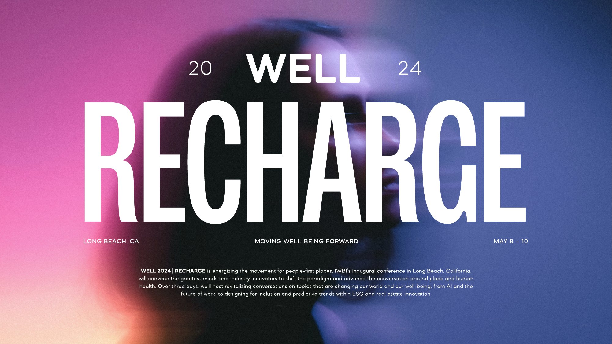
RECHARGE in tall white letters over a pink and blue haze, with WELL 2024 above
Four tall panels showing the sky at 6 AM, 12 PM, 6 PM and 11 PM
A palette drawn from the light at 6 AM, noon, 6 PM and 11 PM
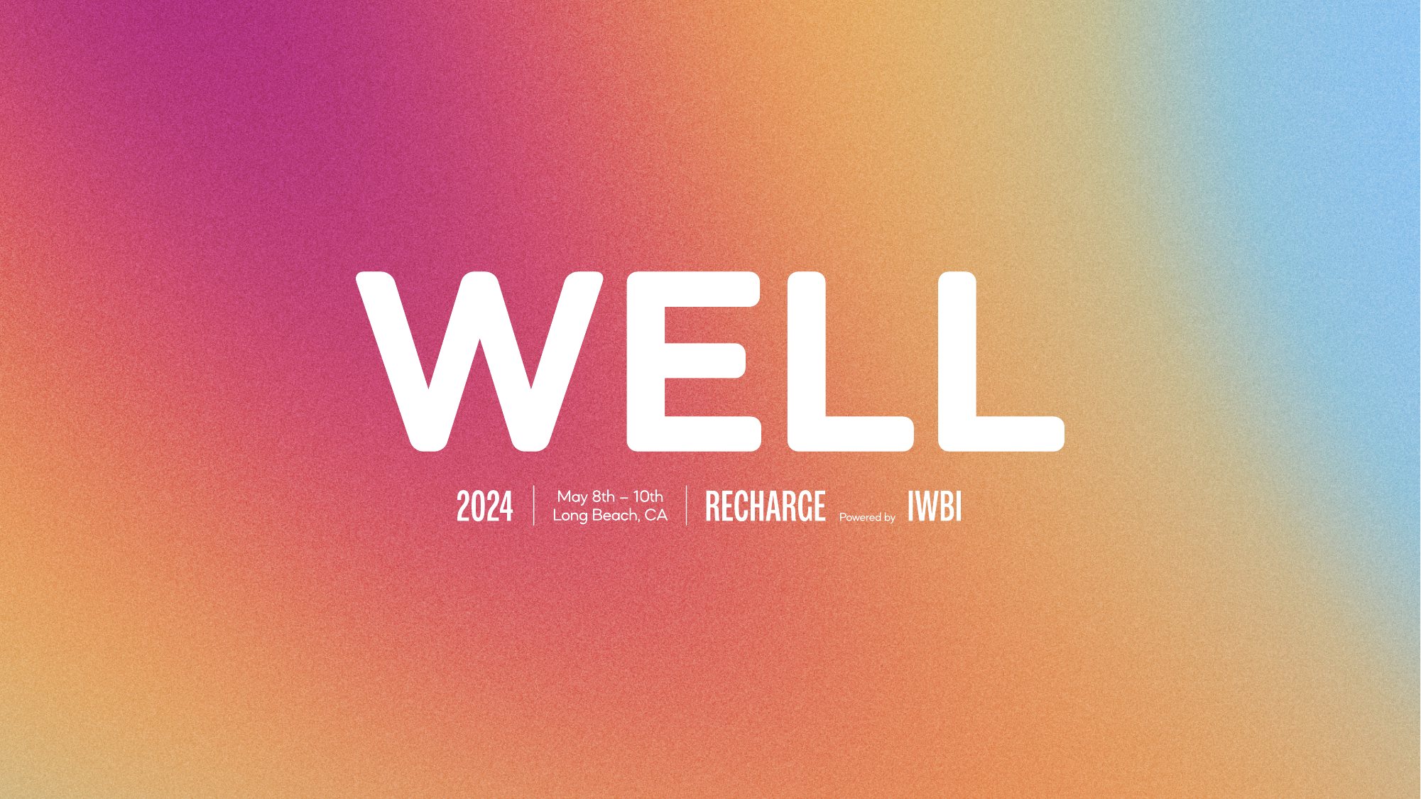
WELL 2024 wordmark on a warm sunrise gradient
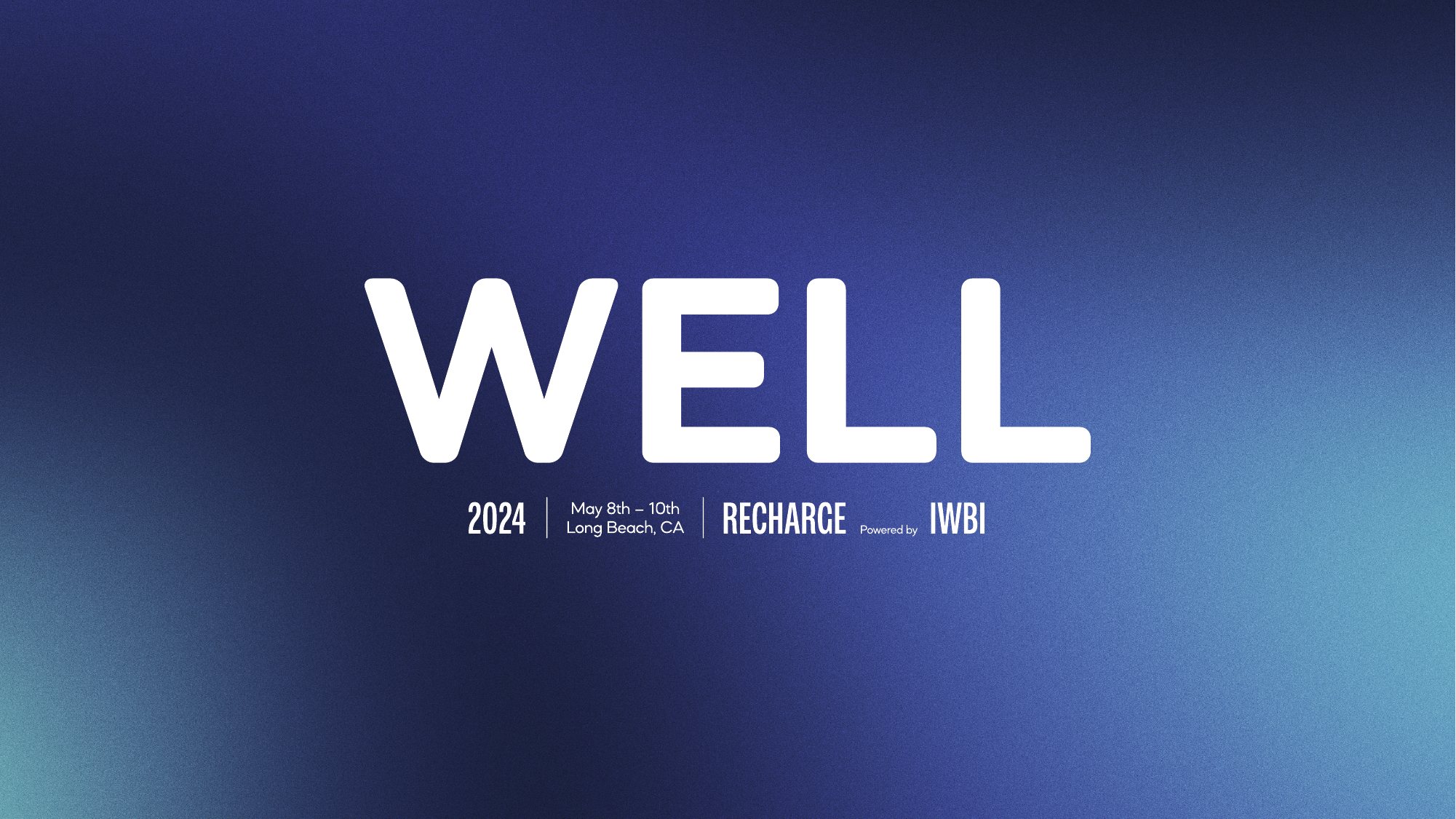
WELL 2024 wordmark on a deep blue night gradient
WELL 2024 wordmark on a pale blue and magenta gradient
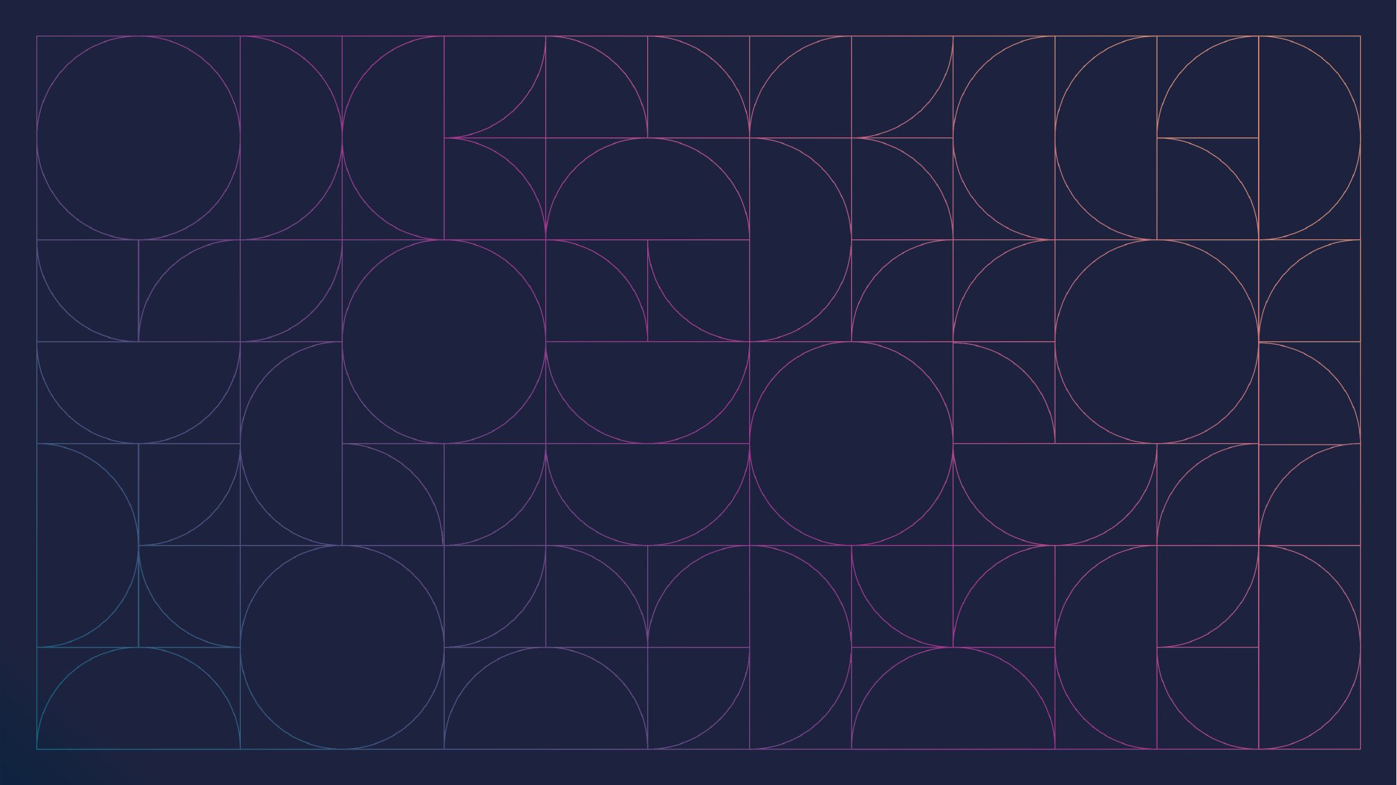
A pattern of fine lines forming circles, half circles and squares on dark blue
Pattern
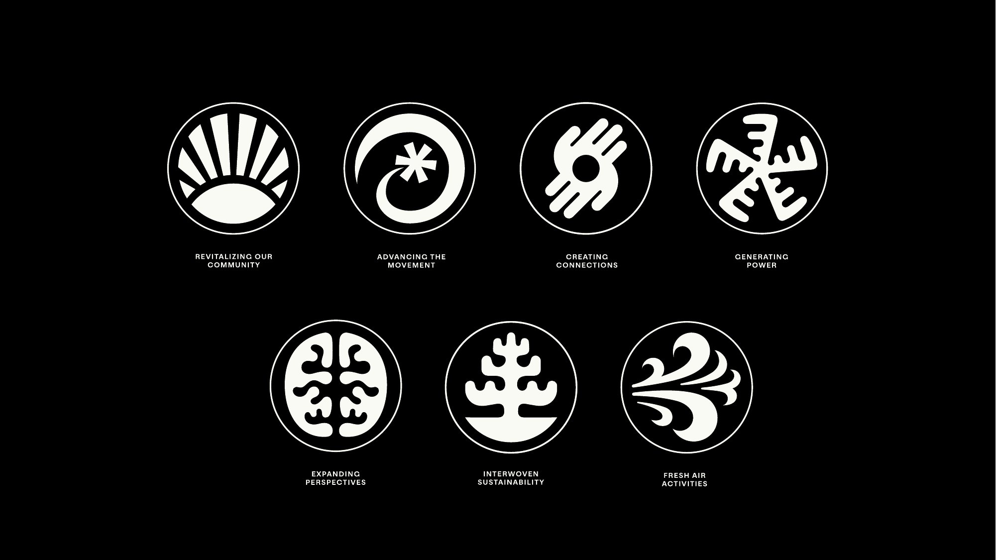
Seven round white icons on black
Seven icons for the program themes
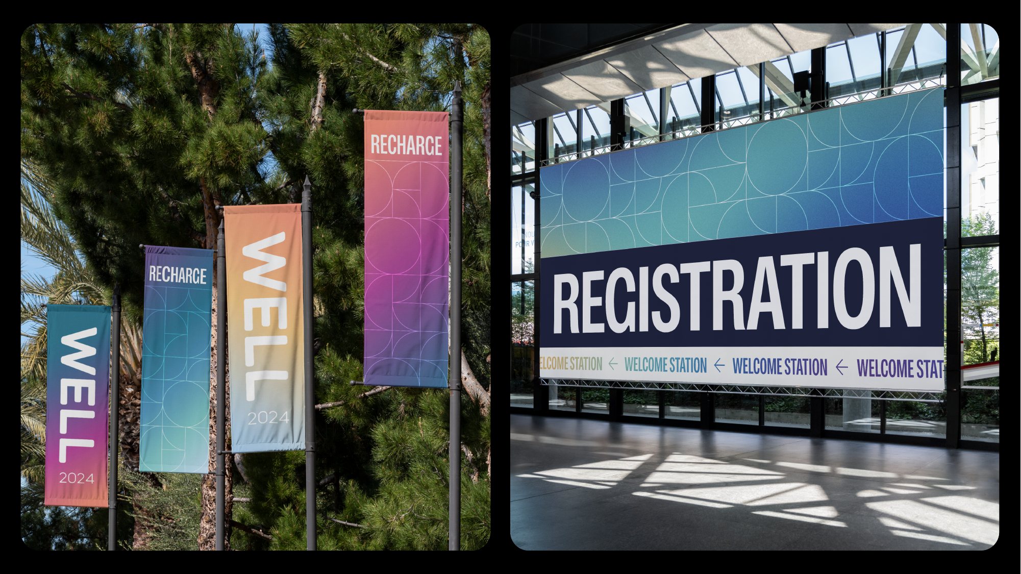
Tall gradient banners among trees and a registration sign
Banners and registration
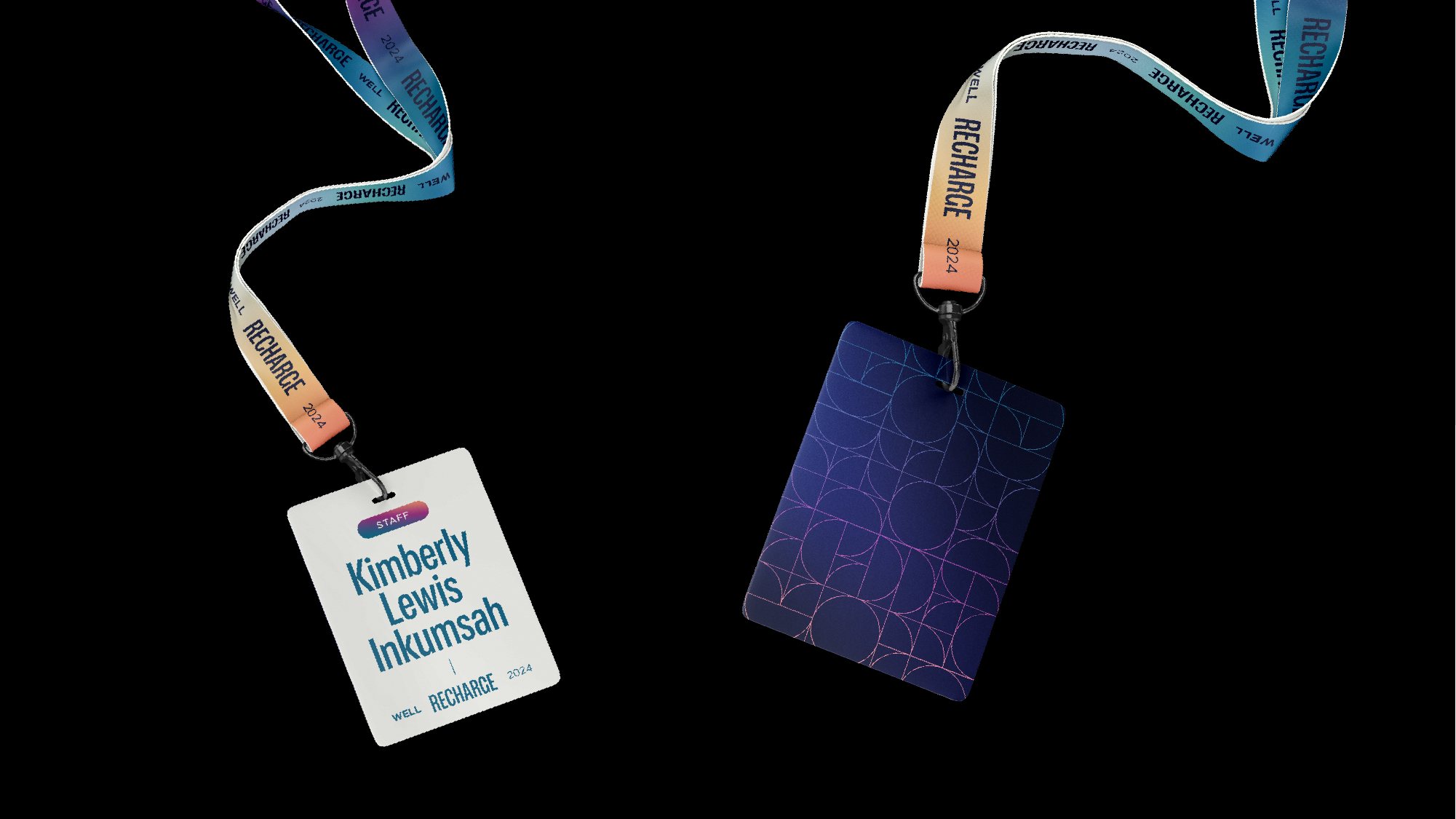
A name badge and lanyard in the event gradients
Badges and lanyards
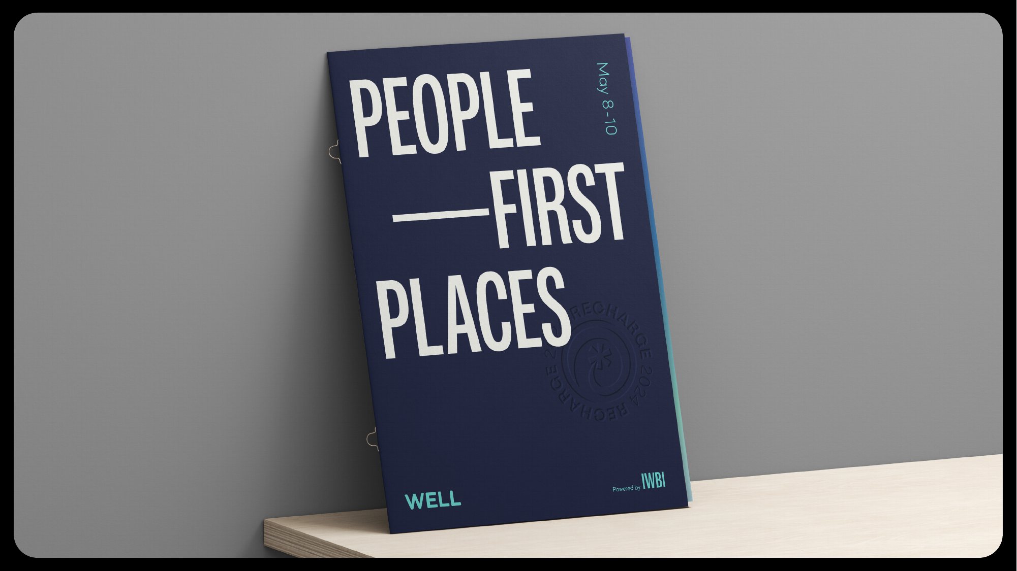
A dark blue program cover reading People-first places
Program
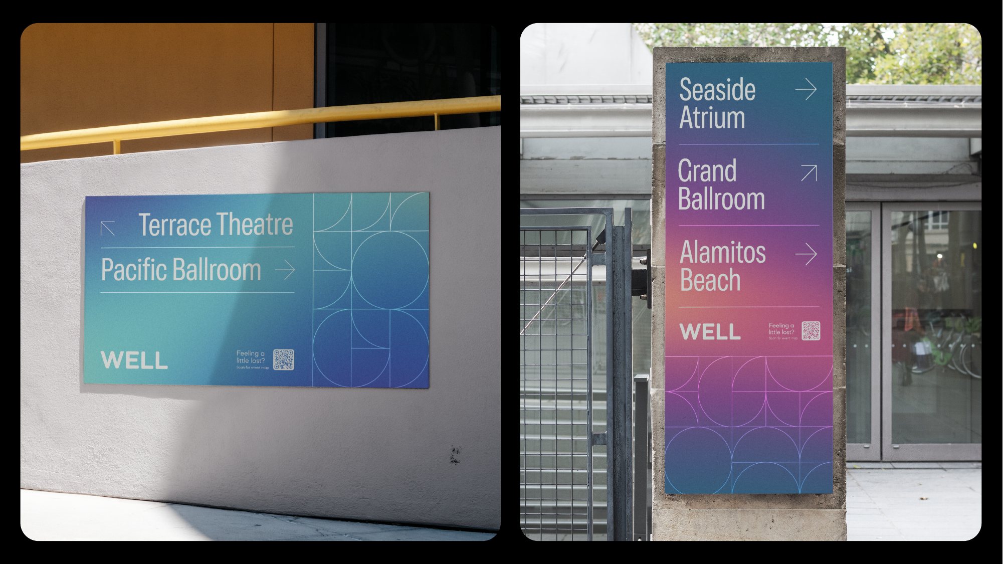
Wayfinding signs in blue and teal gradients
Wayfinding
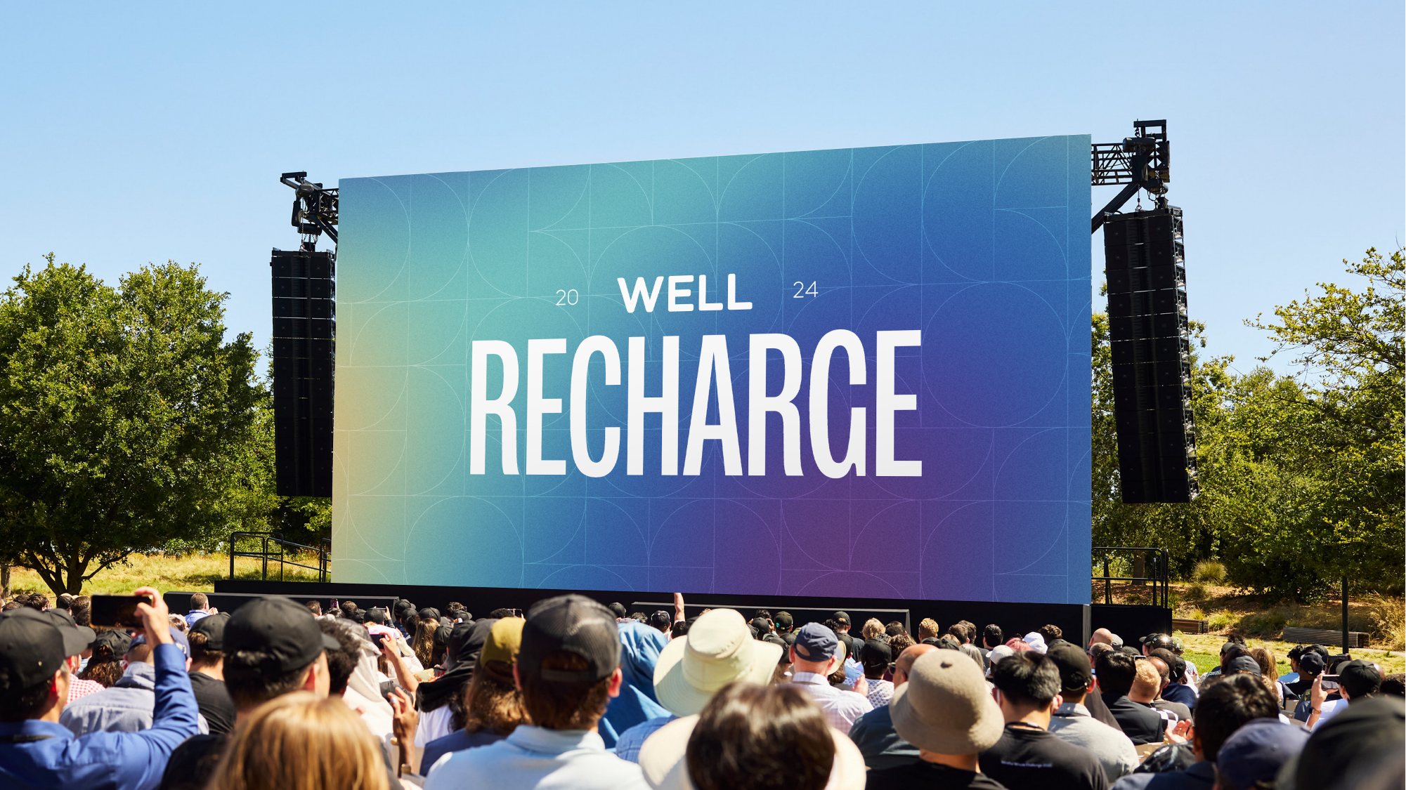
The main stage screen showing WELL 2024 Recharge above a crowd outdoors
Main stage
The WELL 2024 Recharge landing page: the title over a sunset gradient, the WELL Conference, and a row of host cities
Landing page

Identity with Smith & Diction.

05

Earlier work

Making WELL recognizable. My first work at IWBI introduced the WELL Health-Safety seal to the people encountering it in everyday life. A public-facing website explained what it stood for, followed by a short film that introduced WELL’s broader purpose.

From belief to practice

My work at IWBI connects the promise of WELL with the experience of using it. Across brand, product and events, I work with colleagues in product, engineering and marketing, alongside studio partners, to make that promise tangible. Every part has a role: helping people understand why healthier places matter, see where they can contribute and take the next step.

← Back

Next

Fieldguide.ai​Change Theory

Founder & CEO​2015–2021

View next →
← BackFieldguide
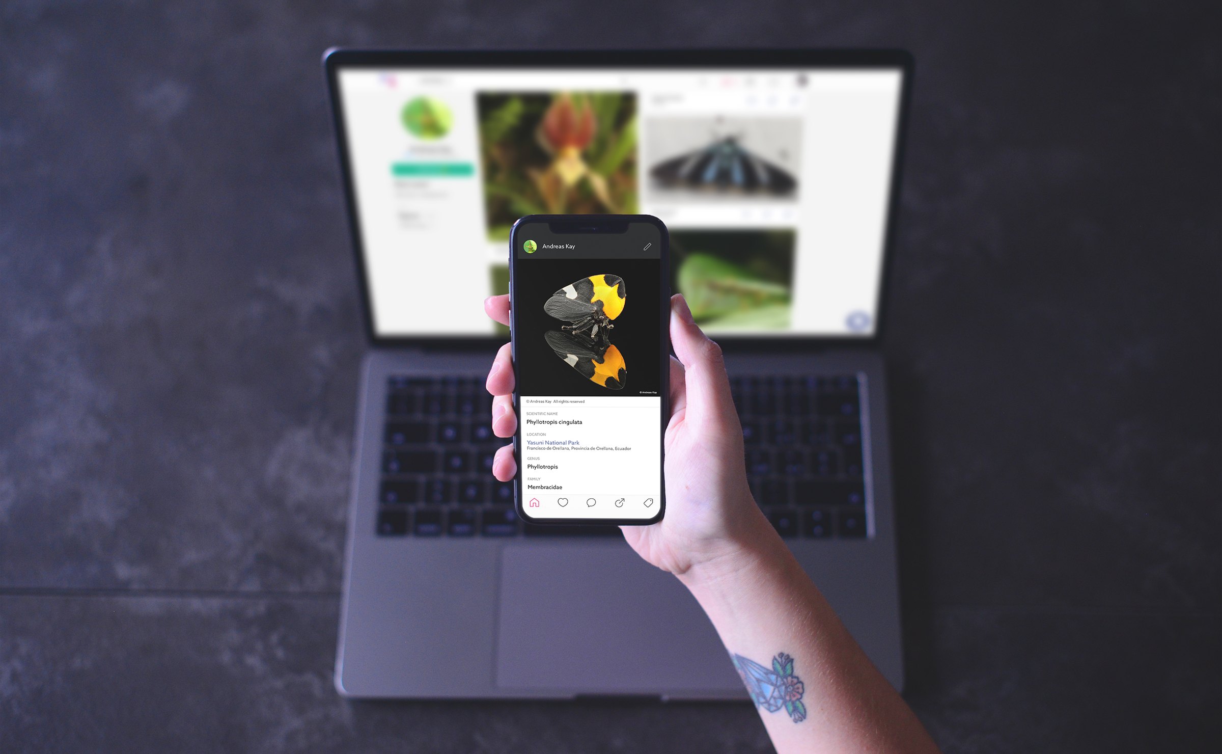
A hand holding a phone that shows an insect’s page in the Fieldguide app, with the Fieldguide website on a laptop behind

Founder & CEO​2015–2021

Fieldguide

The curious. Curiosity gives us a reason to look closer. I founded Fieldguide to give anyone a way to contribute to our understanding of the natural world. We brought identification, shared knowledge and observation into one experience, making something as simple as noticing a moth a starting point for participating in science.

I set the vision and led product, design and brand, with a team across frontend, backend and computer-vision engineering.

What’s this?

A small question opens up a whole world. Fieldguide starts with a photo and helps you discover what you’ve found, understand its place in nature and add what you’ve seen to a shared body of knowledge.

01 Identify

Put a name to what you find

A photo brings a suggested identification in moments, with AI models trained across more than 20,000 fine-grained classes for moths and butterflies alone.

02 Learn

Get to know the life around you

Explore each species through its place in the tree of life, a map of where it’s found and reference photos across its life stages. Learn from other people looking closely, too.

03 Contribute

Add your observation to our shared understanding

Every record you publish adds to what the community can discover and the models can learn to recognize. Your curiosity becomes part of a growing guide to the natural world.

100,000

monthly active users at peak

80 million+

images gathered across the platform

20,000+

fine-grained classes for moths and butterflies alone

A family of apps

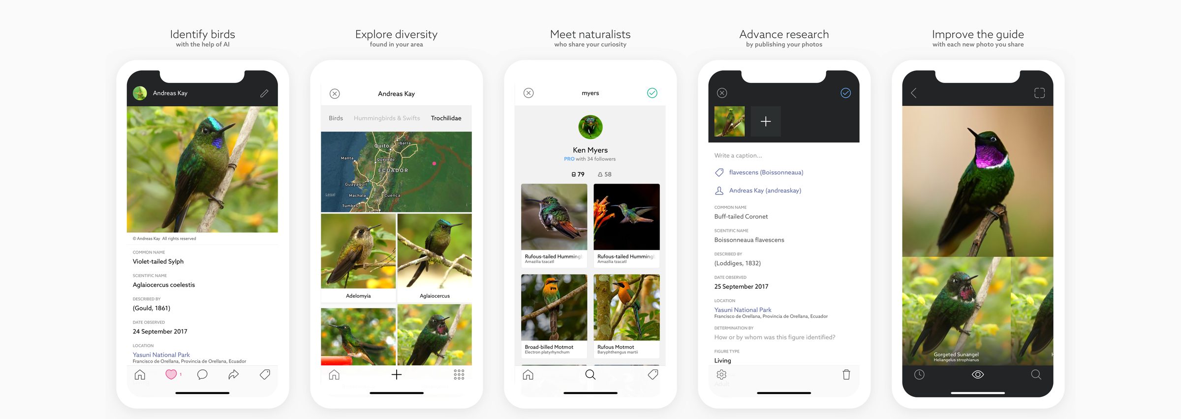
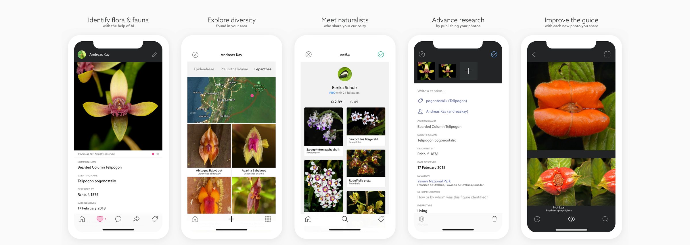
People find their way into nature through different interests. Leps came first, for moths and butterflies. Birds, Odes, Fungi and Plants followed, giving each community a focused place to explore and contribute. All shared the same platform, with Fieldguide bringing the breadth of life together in one app.

Five screens of the Birds by Fieldguide app
Birds by Fieldguide: App Store screens
Five screens of the Fieldguide app
Fieldguide: App Store screens

From curiosity to community

I began building Fieldguide in 2015 and launched the first version about a year later. The design challenge was to turn advances in computer vision into something useful in the moment someone encountered an unfamiliar plant or animal.

Identification gave people a reason to begin. The opportunity to compare observations, discuss findings and learn from one another gave them reasons to return. Building Fieldguide taught me how an immediate, personal need could become a lasting connection to a community and its shared work.

← Back

Next

U.S. Green Building Council

Creative Director​2006–2015

View next →
← BackU.S. Green Building Council
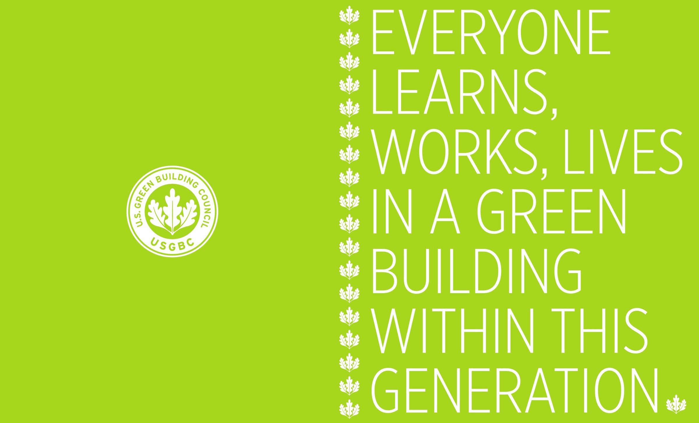
Brand book cover: Everyone learns, works, lives in a green building within this generation.

Creative Director​2006–2015

U.S. Green Building Council

A movement. Everyone should learn, work and live in a green building within a generation. USGBC’s vision challenged what we had come to expect from buildings. Over nine years, I led design across USGBC, LEED and Greenbuild, helping give that vision an identity people could believe in and make their own.

Working with a close group of partner studios, I brought the three brands into one family. The work was recognized with the National Design Award for Corporate Achievement.

Creative direction throughout; art direction on most projects. Studio partners credited per piece.

01

USGBC

The identity. A shared ambition needs a recognizable expression. Beginning with the USGBC seal, I helped establish a visual language that connected the organization’s voice with the everyday ways people encountered it.

USGBC logo, 1993USGBC logo, 2006

With Doyle Partners, I led the redraw of the original seal, replacing its stock oak leaves with a distinctive mark.

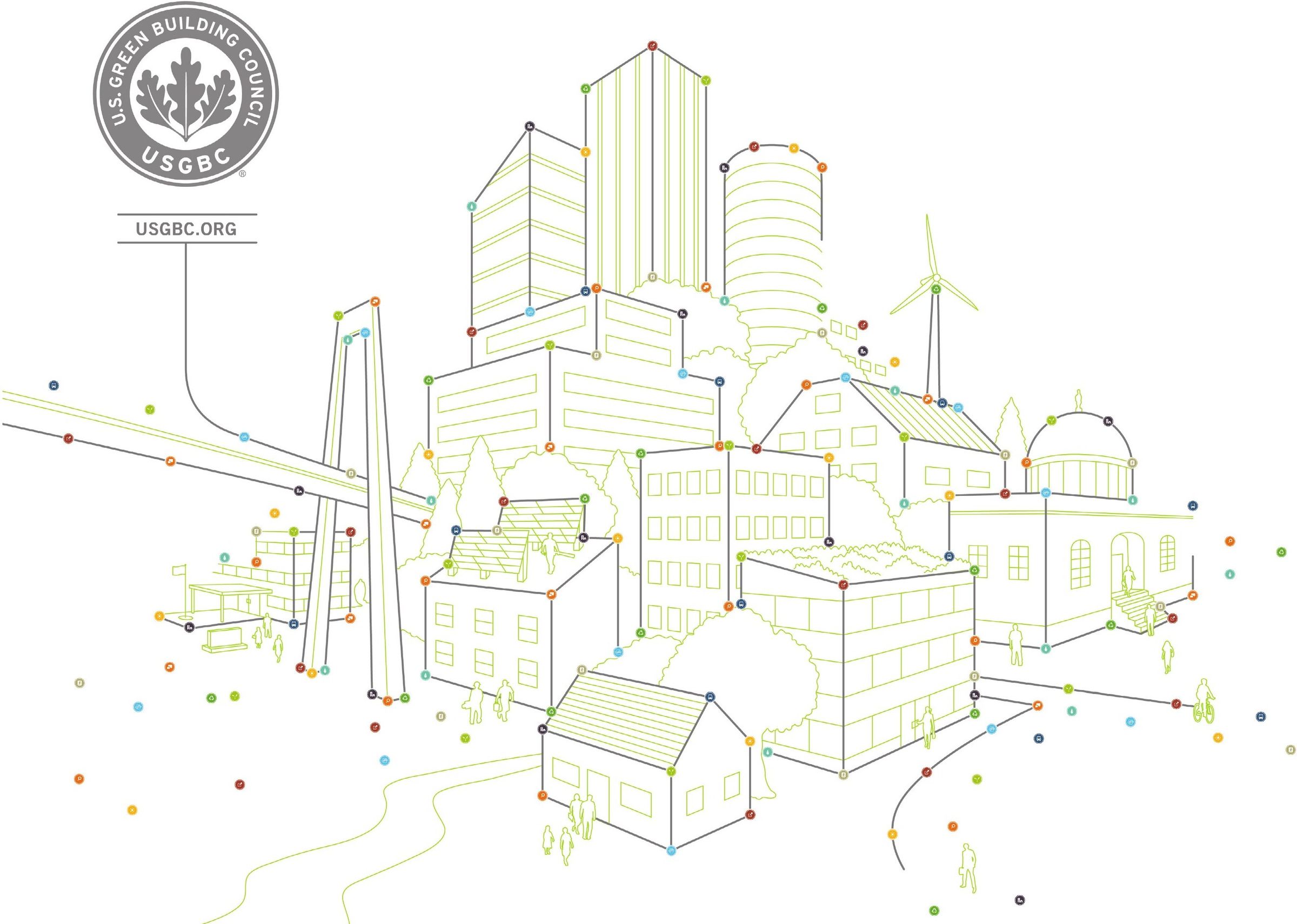
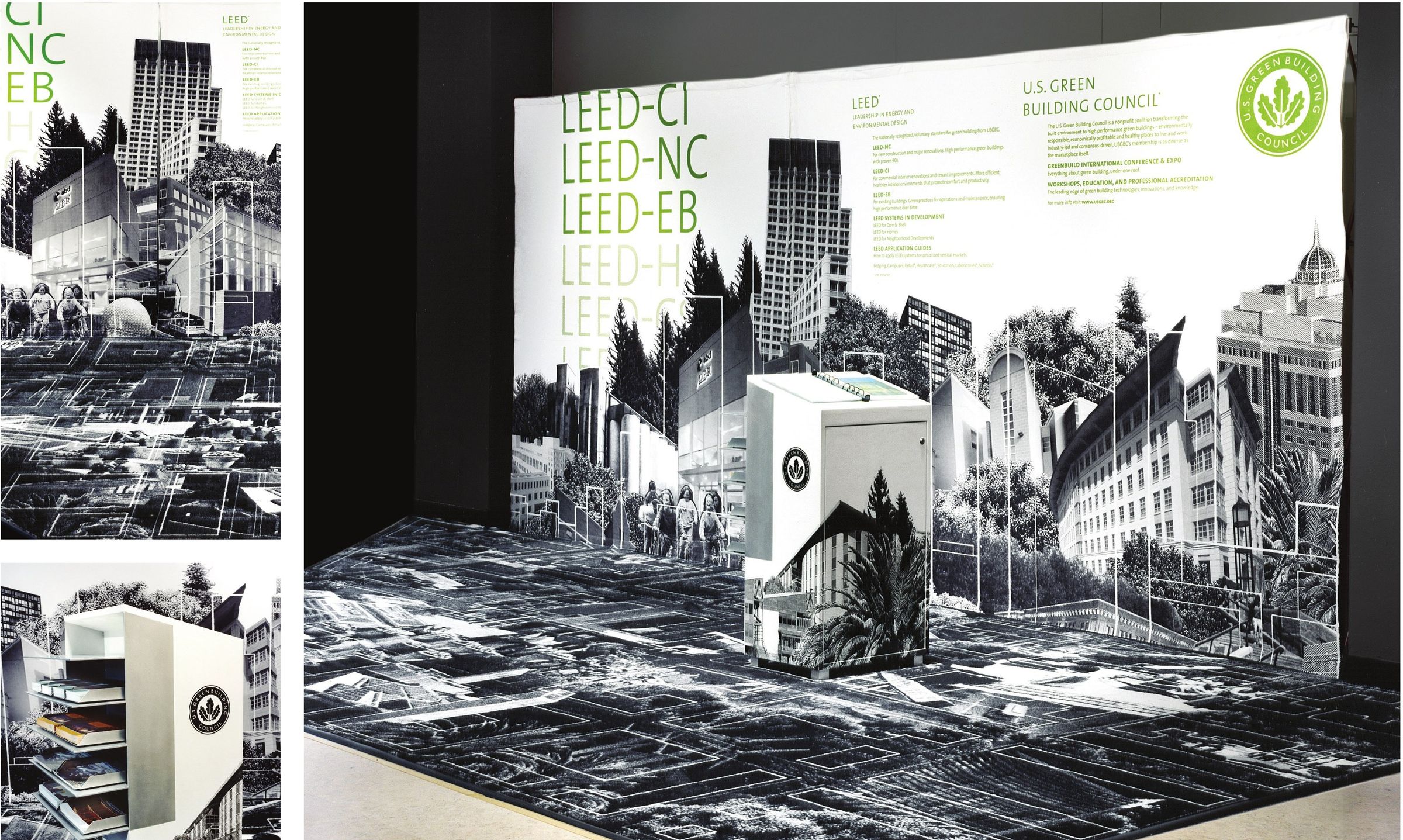
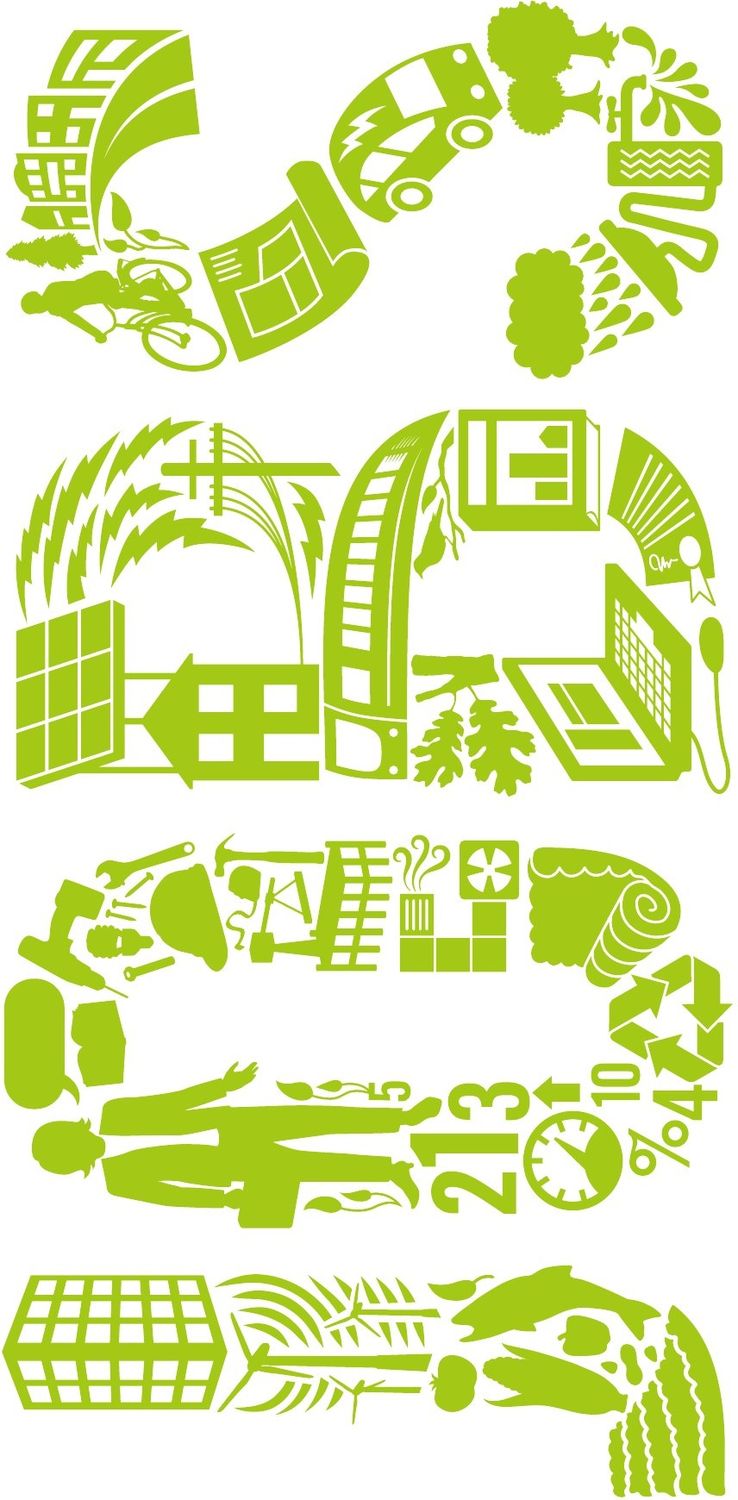
“Connect the Dots” illustration and trade show backdrop, 2011
“Connect the Dots” illustration and trade show backdrop, 2011. With Post Typography
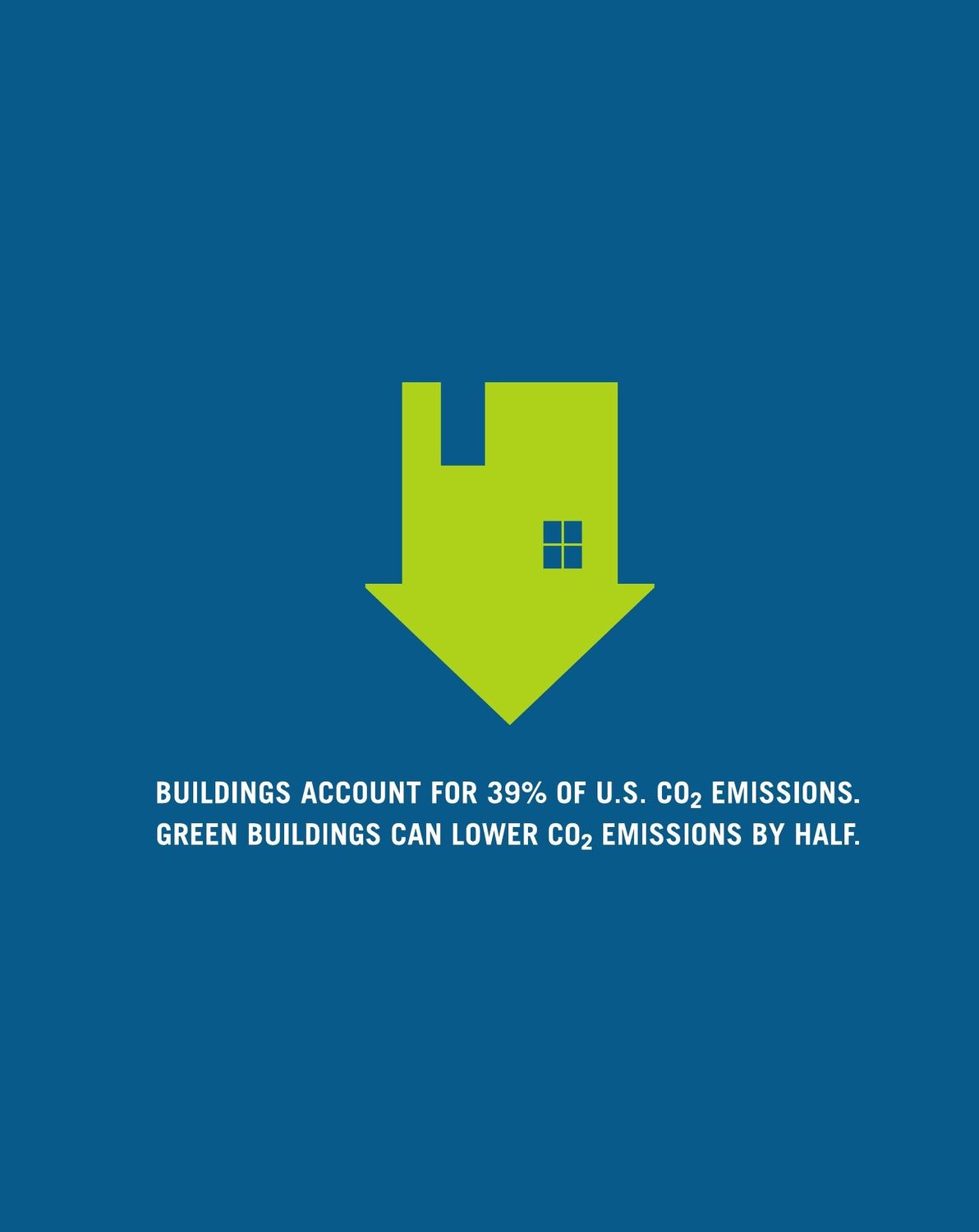
Carbon emissions ad, 2007: the case for the movement in two sentences
Carbon emissions ad, 2007: the case for the movement in two sentences. With Post Typography
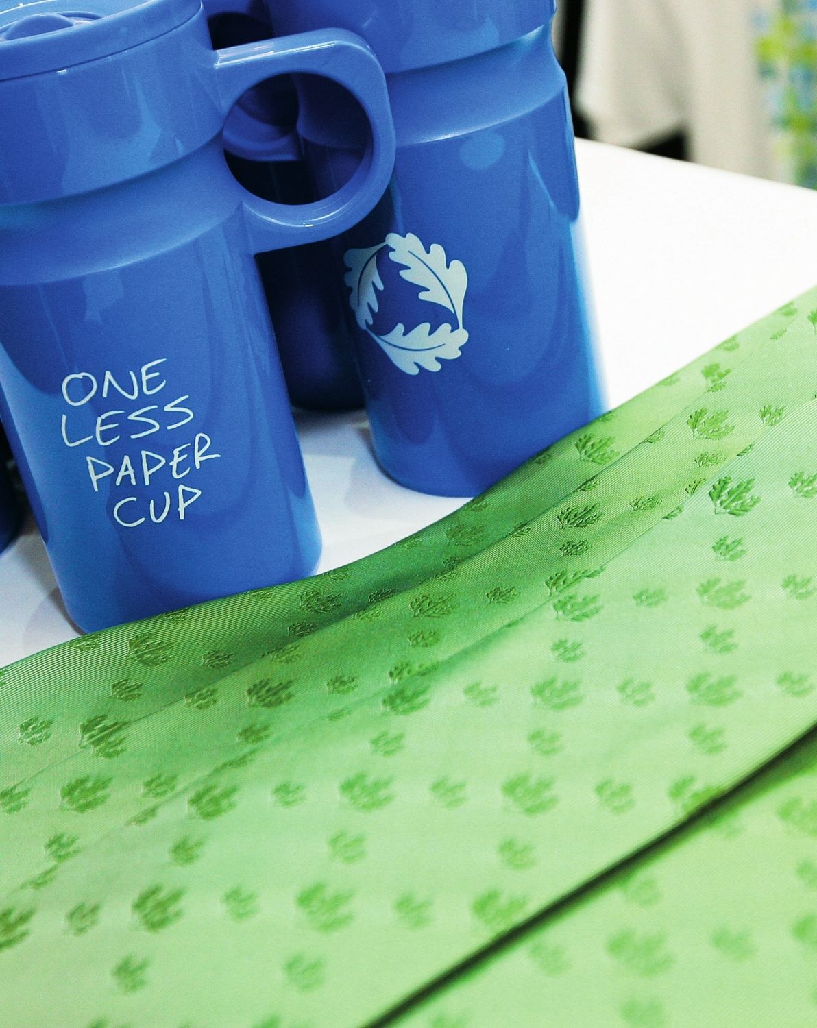
“One less paper cup”: the brand on everyday objects, 2011
“One less paper cup”: the brand on everyday objects, 2011. With Post Typography

Our spaces

Our spaces put the ambition into practice. Offices, exhibitions and gathering places brought sustainable materials and educational design together, giving people a chance to experience the ideas for themselves.

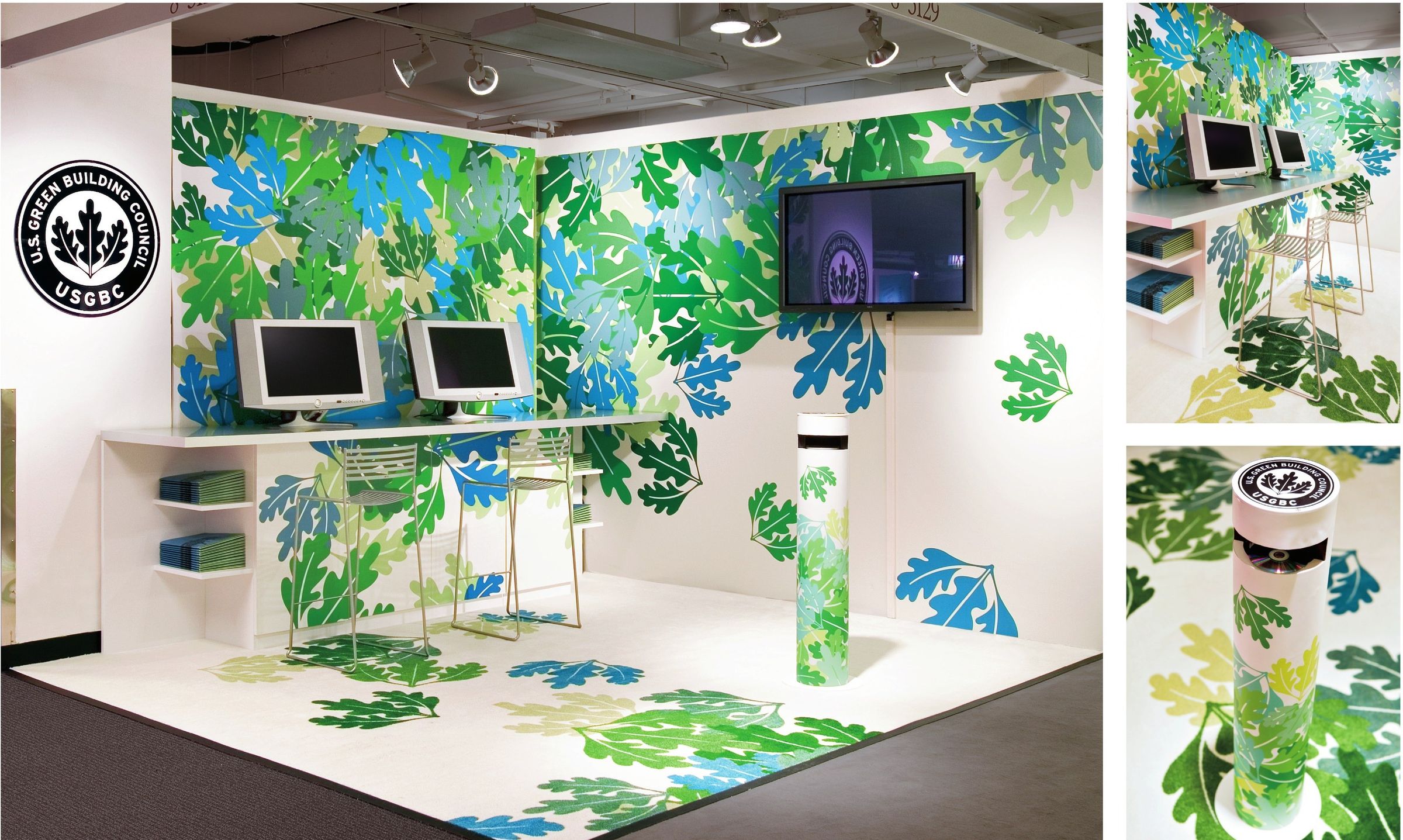
Trade show booth, 2004–05
Trade show booth, 2004–05. With Shaw Jelveh Design
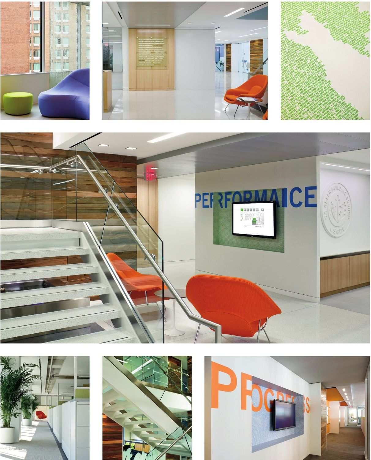
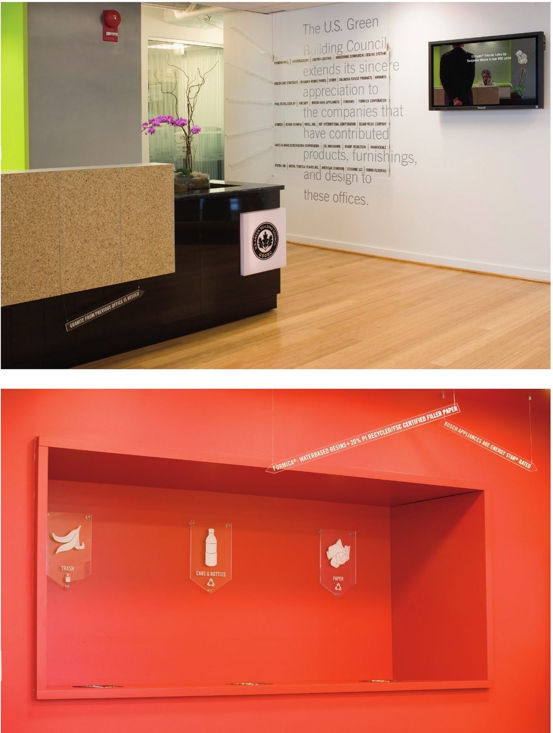
Headquarters, 2101 L Street NW: environmental graphics, 2009
Headquarters, 2101 L Street NW: environmental graphics, 2009. With Envision Design and Shaw Jelveh Design
Headquarters, 1800 Massachusetts Ave: graphics and signage, 2006
Headquarters, 1800 Massachusetts Ave: graphics and signage, 2006. With Shaw Jelveh Design
Trade show booth, 2006–08
Trade show booth, 2006–08. With Shaw Jelveh Design
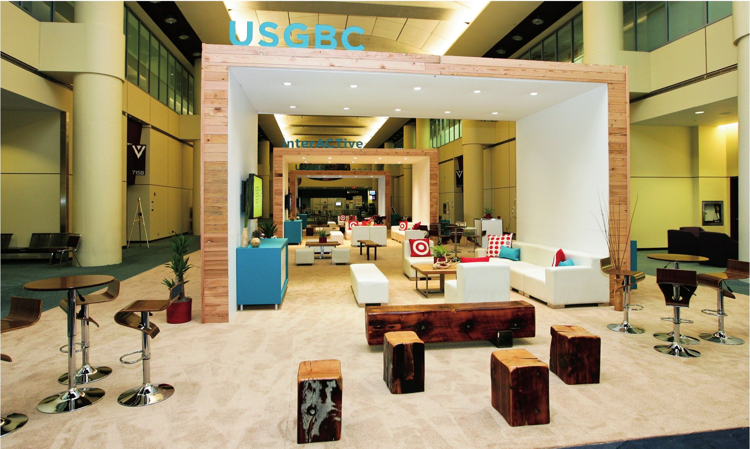
USGBC Lounge, Greenbuild 2011
USGBC Lounge, Greenbuild 2011. With Champion Exposition Services
02

LEED

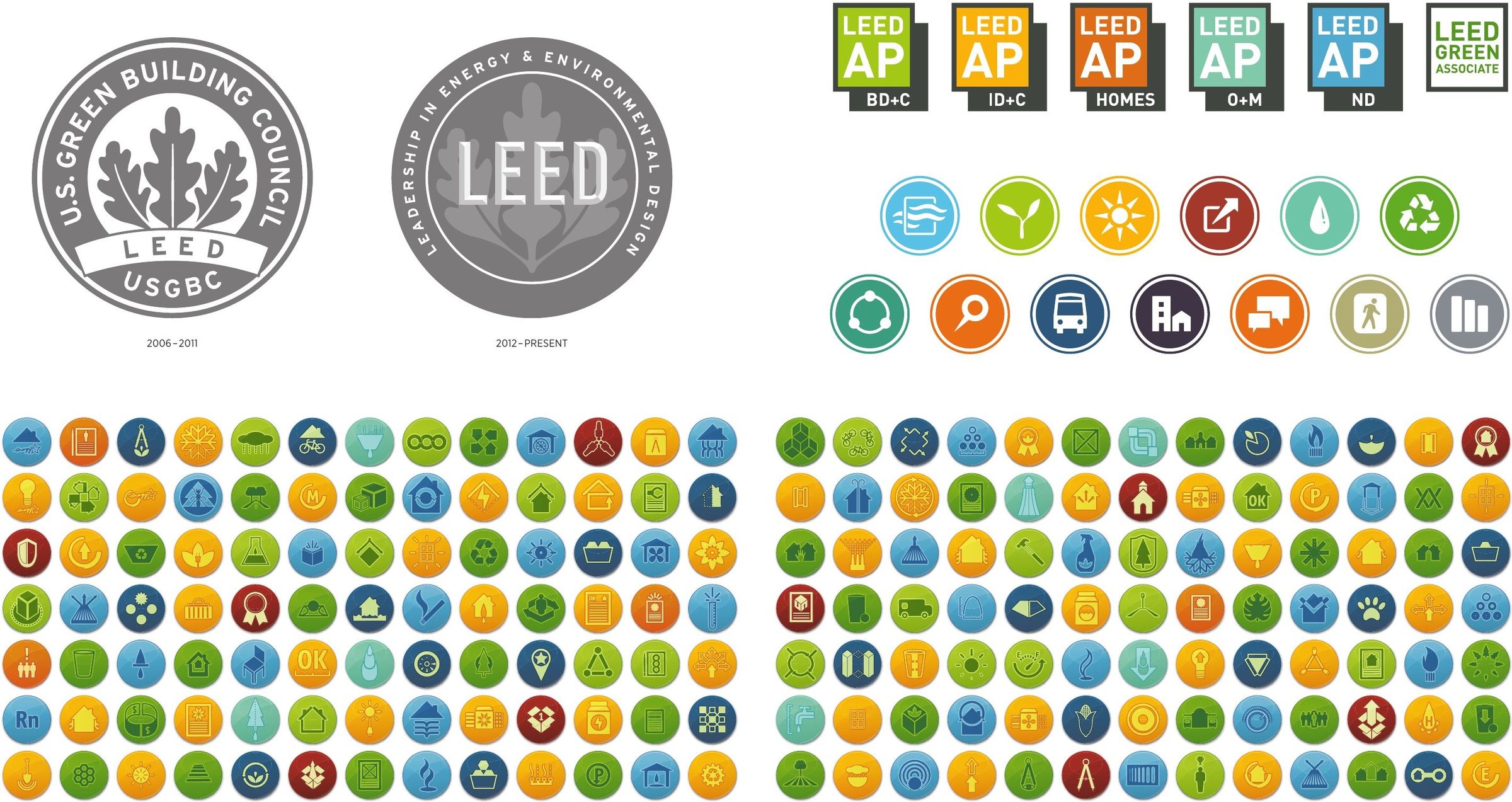
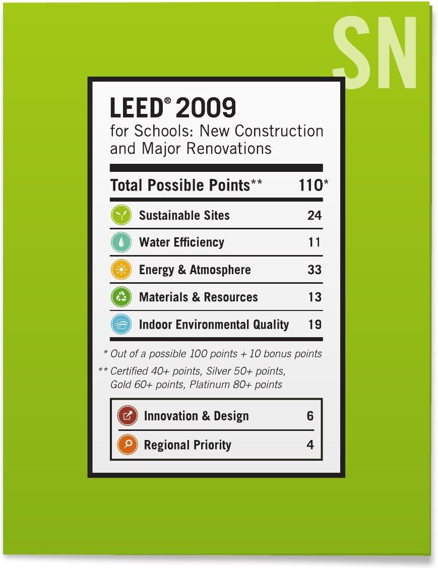
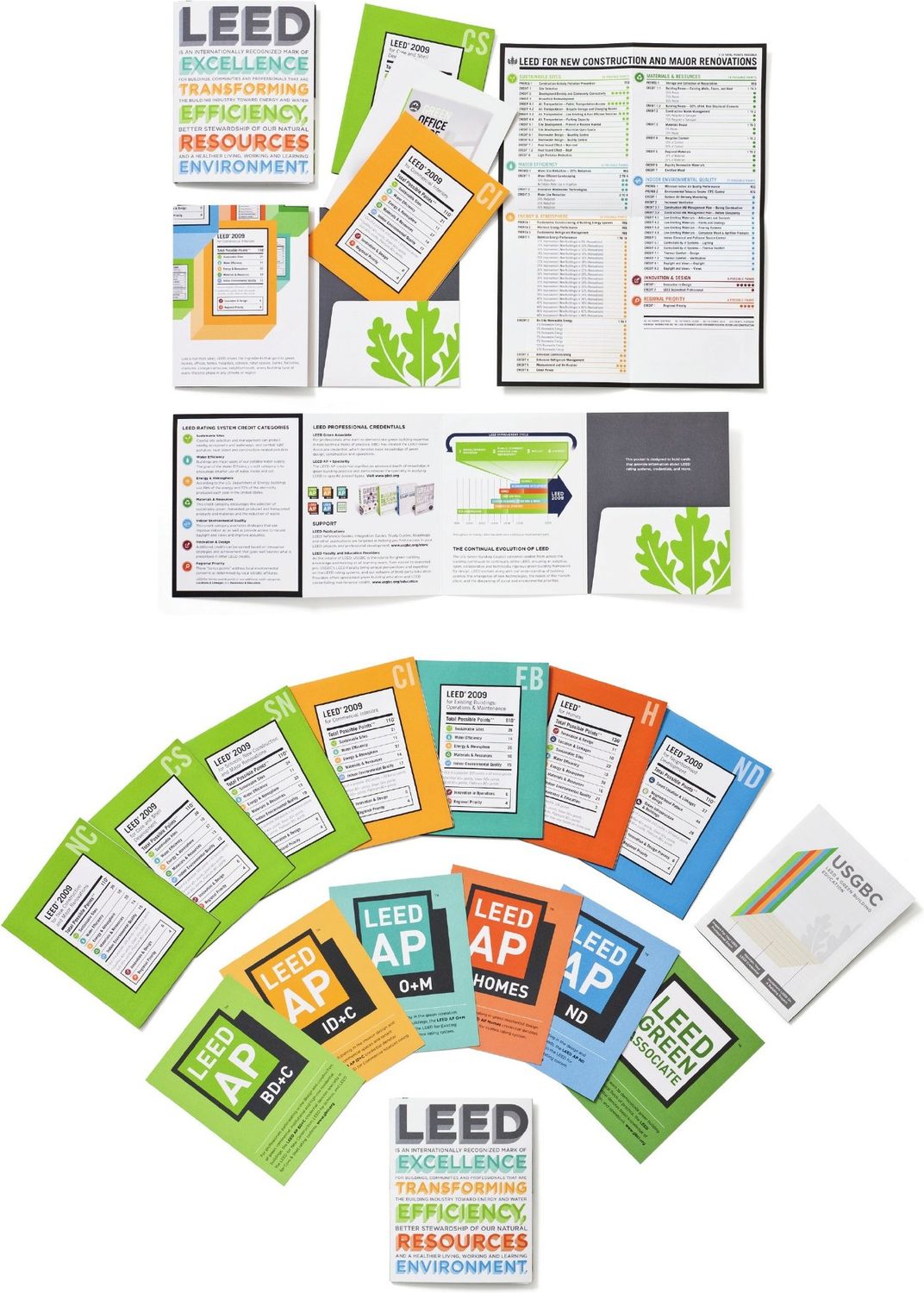
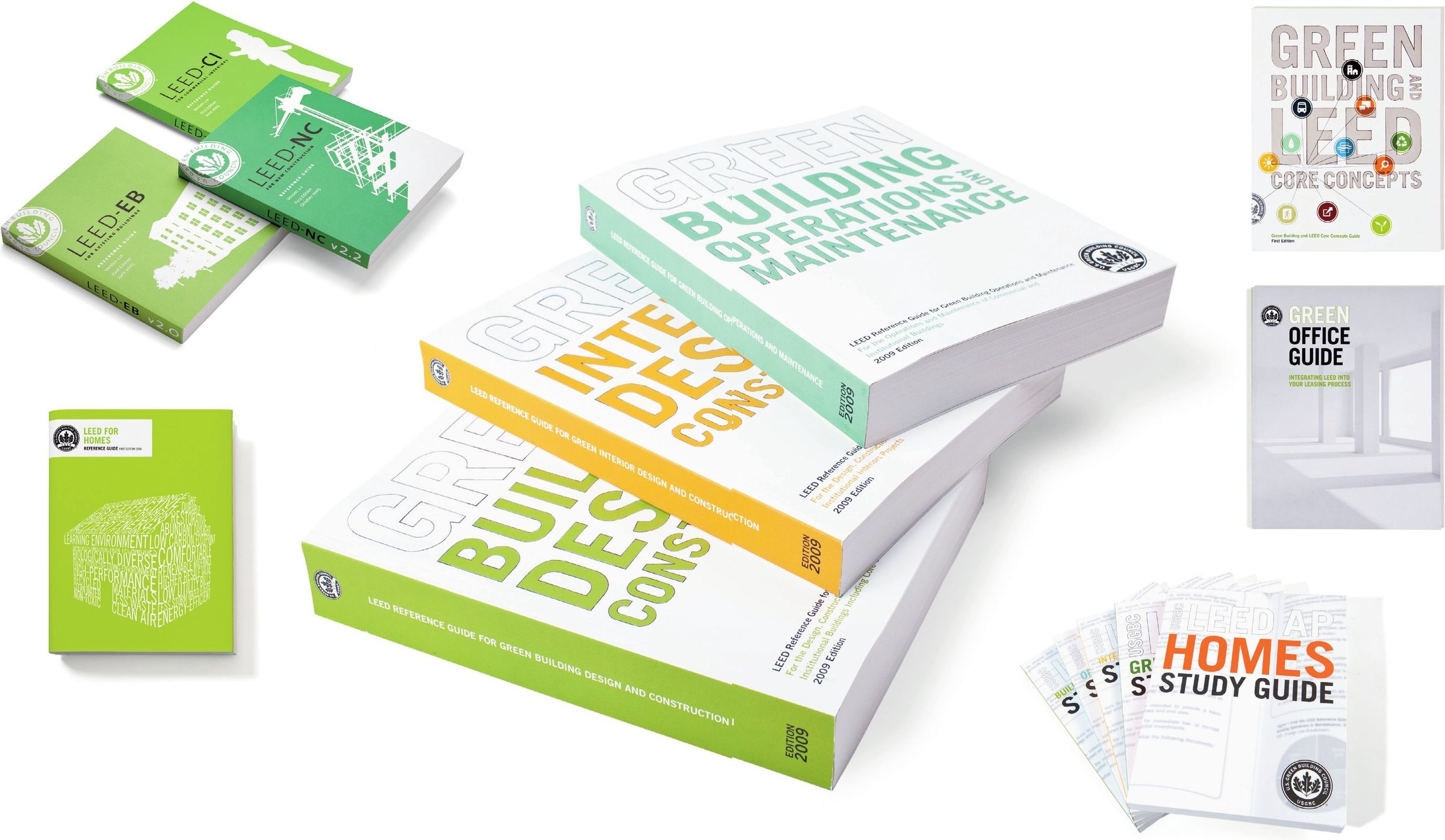
The standard. LEED gave people a way to act on the ambition. My work helped make a complex standard easier to understand and its achievements easier to recognize, from credit icons and reference guides to the plaque on a finished building.

LEED logo, 2006LEED logo, 2012

With our studio partners, I developed a connected design system that supported people as they learned, applied and earned LEED.

One system from mark to credit: LEED marks, credential logos and more than 100 credit icons, 2006–2011
One system from mark to credit: LEED marks, credential logos and more than 100 credit icons, 2006–2011. With Doyle Partners, Shaw Jelveh Design, Modo Design Group and Acorn Signs
The LEED “nutrition label” made a project’s scorecard readable at a glance, 2009
The LEED “nutrition label” made a project’s scorecard readable at a glance, 2009. With Modo Design Group
Modular collateral system, 2009
Modular collateral system, 2009. With Post Typography
Reference guides and study guides, 2005–2009
Reference guides and study guides, 2005–2009. With Shaw Jelveh Design and Post Typography
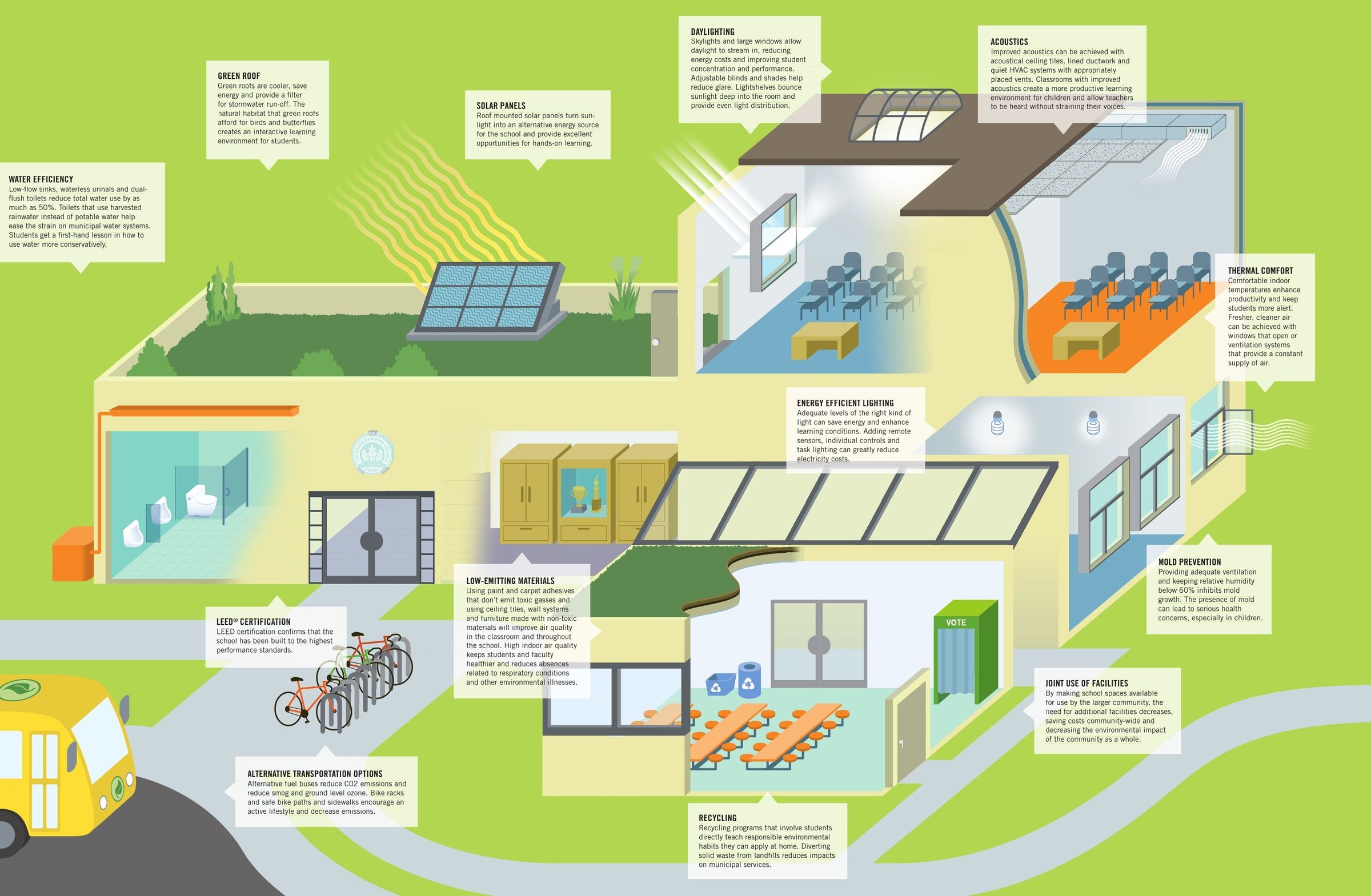
Elements of a Green School, 2007
Elements of a Green School, 2007. With Post Typography
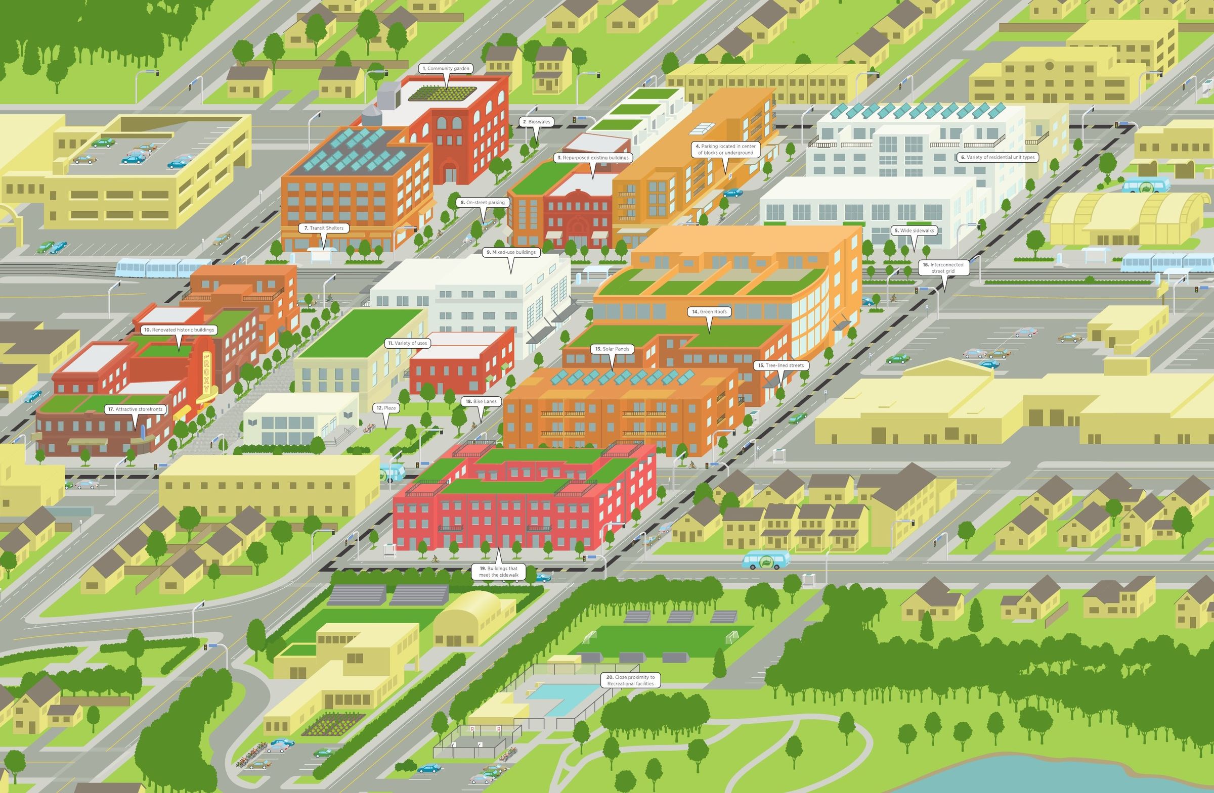
Model LEED Neighborhood, 2007, 2010–11
Model LEED Neighborhood, 2007, 2010–11. With Post Typography
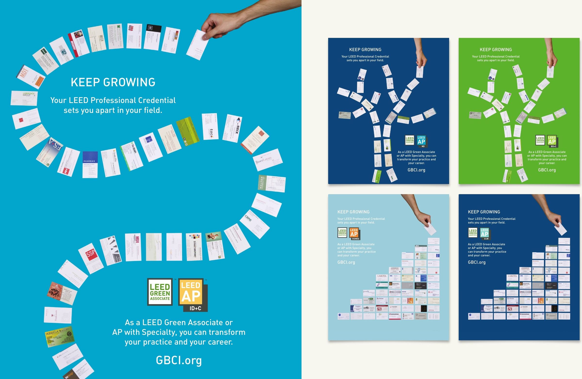
“Keep Growing” credential campaign, 2009
“Keep Growing” credential campaign, 2009. With Shaw Jelveh Design
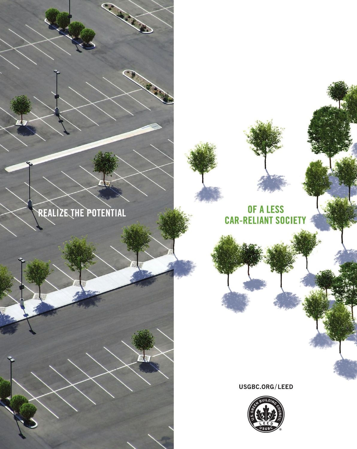
“Realize the Potential” campaign, 2009–10
“Realize the Potential” campaign, 2009–10. With Post Typography
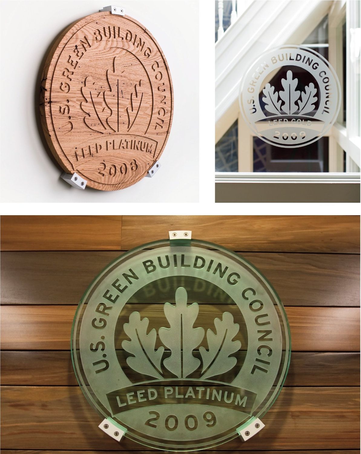
The proof on the wall: LEED certification plaques in recycled glass and reclaimed wood, 2008–2011
The proof on the wall: LEED certification plaques in recycled glass and reclaimed wood, 2008–2011. With Green Plaque
03

Greenbuild

The gathering. Greenbuild brought people together around what they could accomplish. I led its creative direction, giving each year a distinct expression rooted in its host city and connected to the larger movement.

Greenbuild logo, 2002Greenbuild logo, 2007Greenbuild logo, 2009

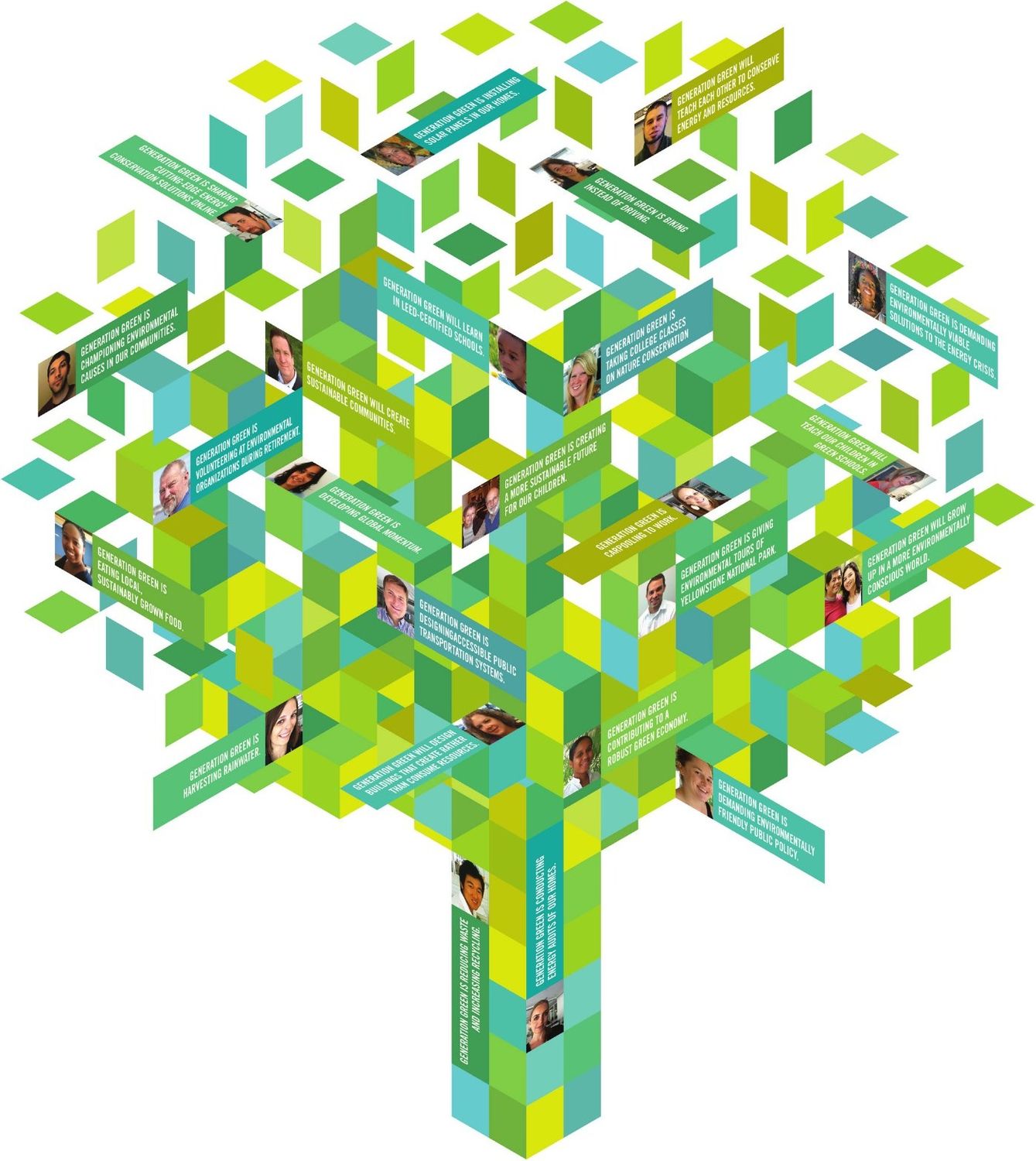
The identity carried through campaigns, programs and the spaces people shared. During that time, attendance grew from fewer than 10,000 to more than 30,000 at its peak.

<10,000 → 30,000+
Greenbuild attendance

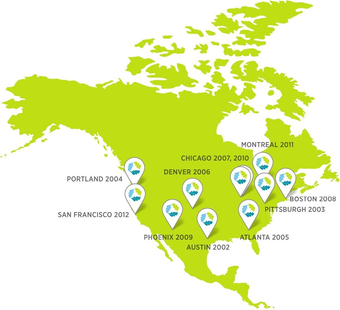
Host cities, 2002–2012
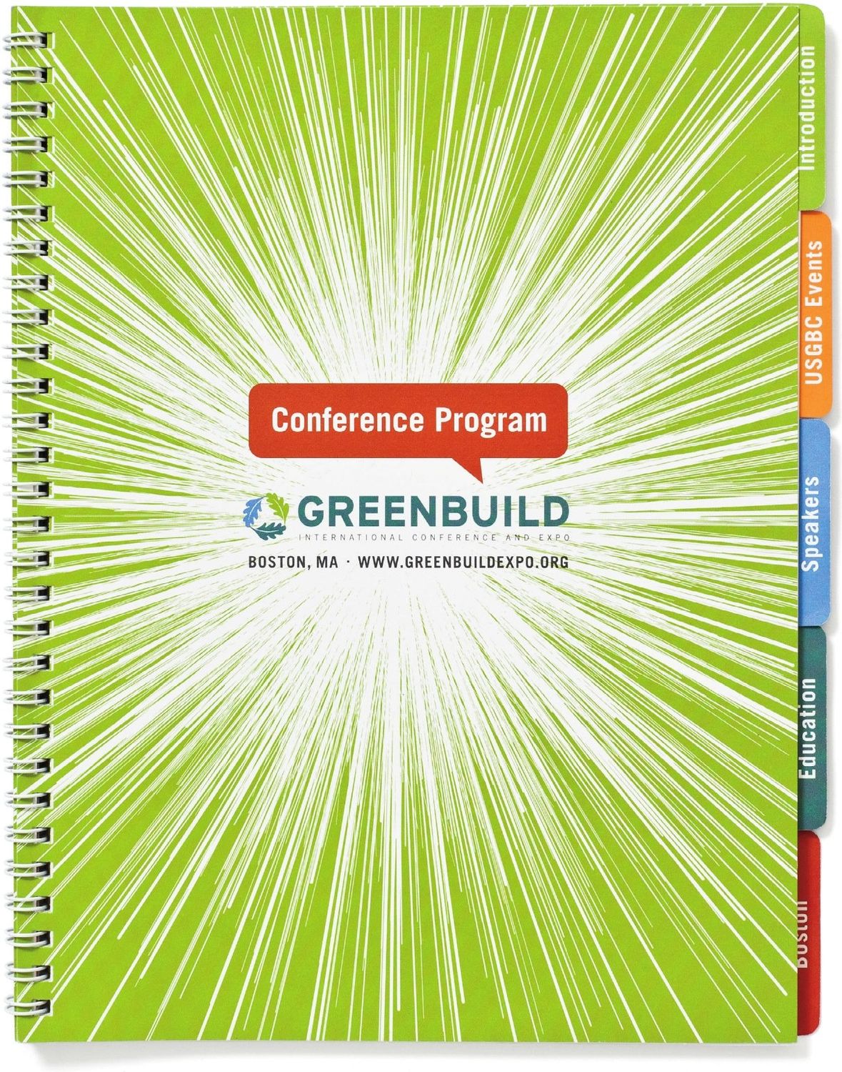
Boston 2008 conference program
Boston 2008 conference program. With Post Typography
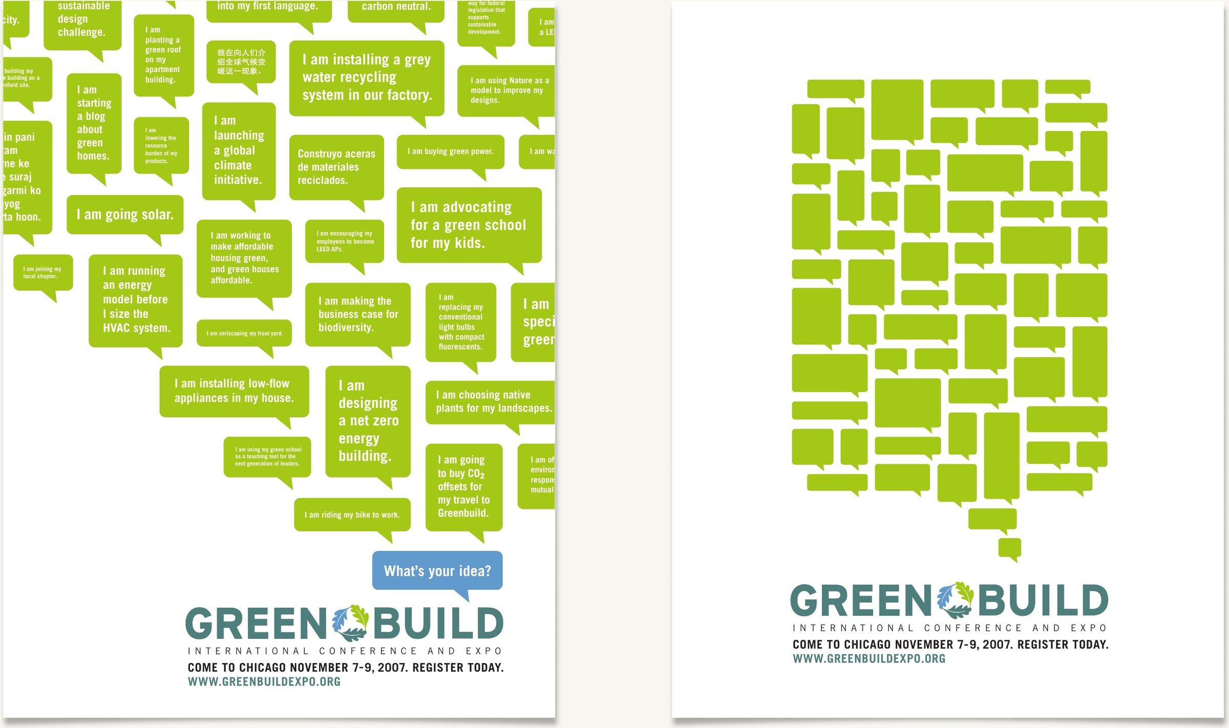
Chicago 2007 campaign
Chicago 2007 campaign. With Post Typography
Phoenix 2009 theme illustration
Phoenix 2009 theme illustration. With Post Typography
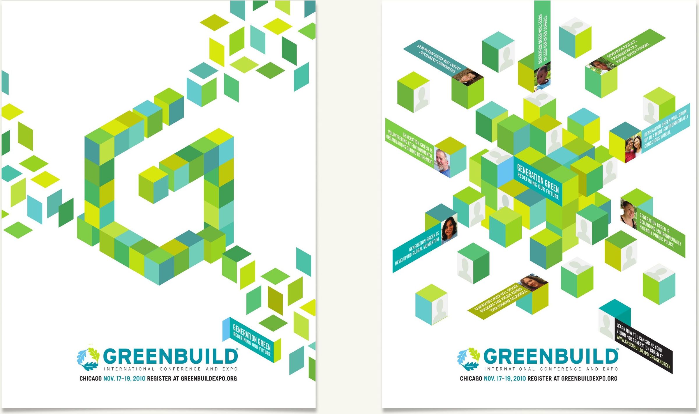
Chicago 2010 poster
Chicago 2010 poster. With Post Typography
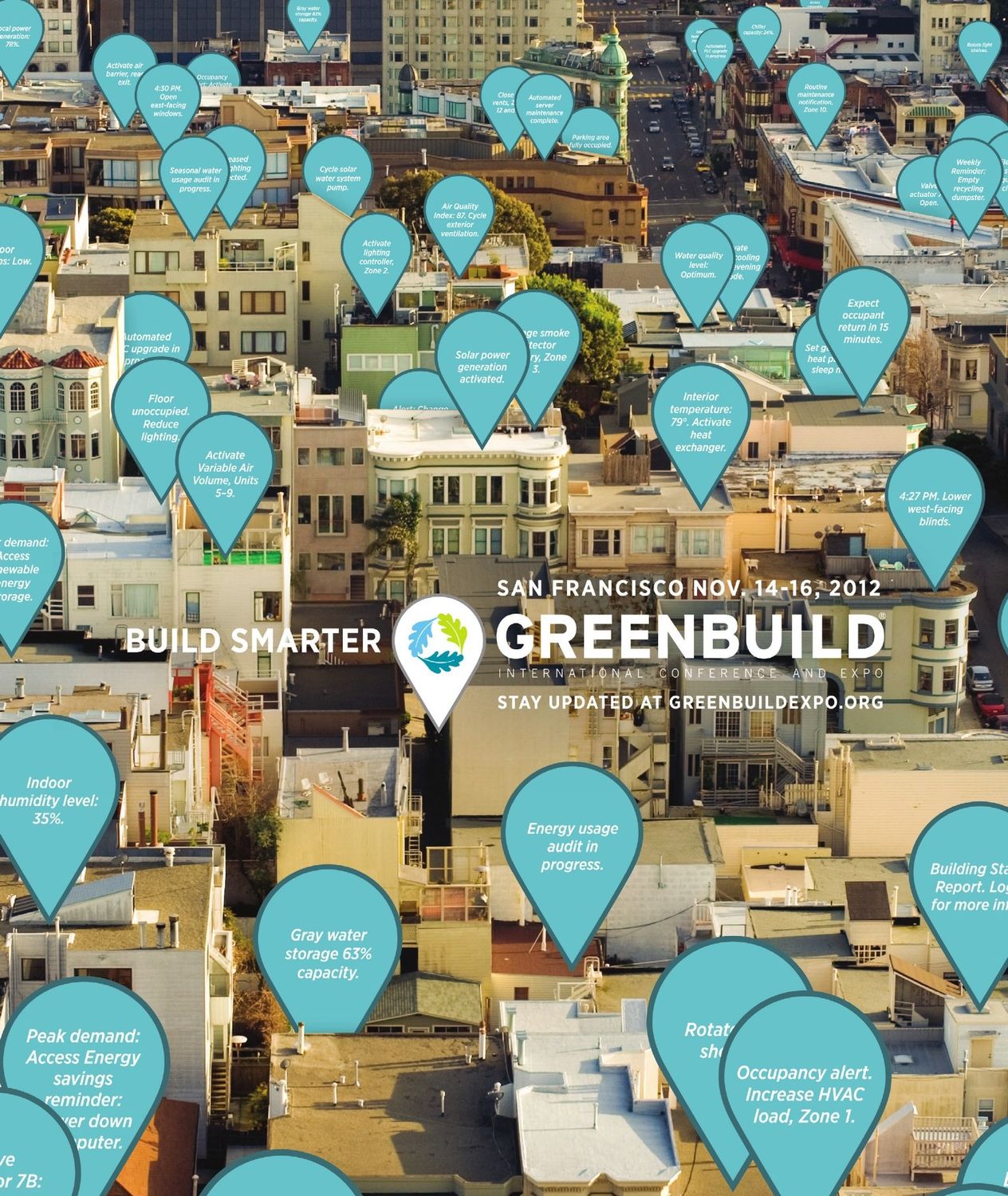
San Francisco 2012 identity
San Francisco 2012 identity. With Post Typography
Chicago 2010 campaign
Chicago 2010 campaign. With Post Typography
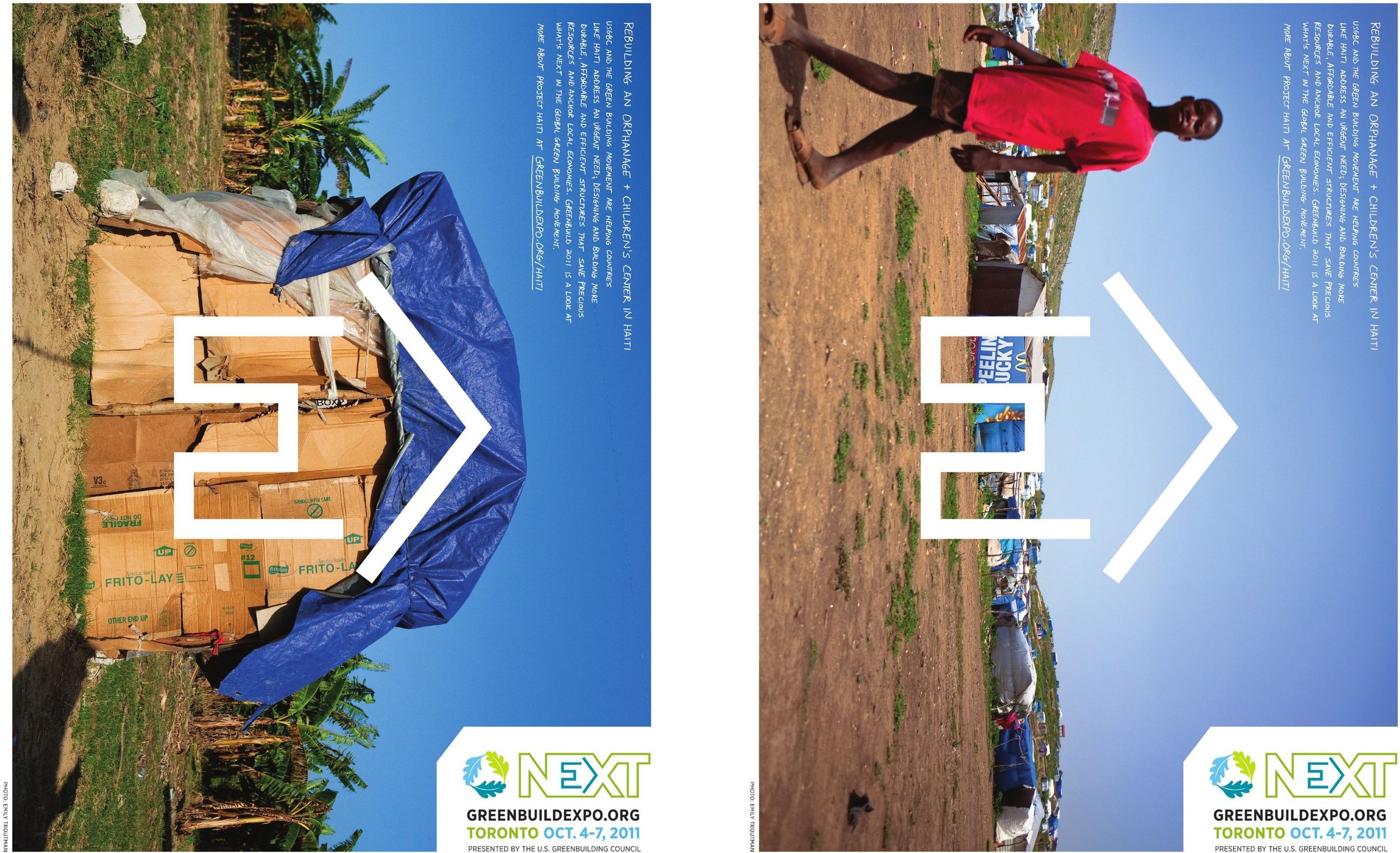
Toronto 2011, “NEXT.” With Post Typography; photography by Emily Troutman
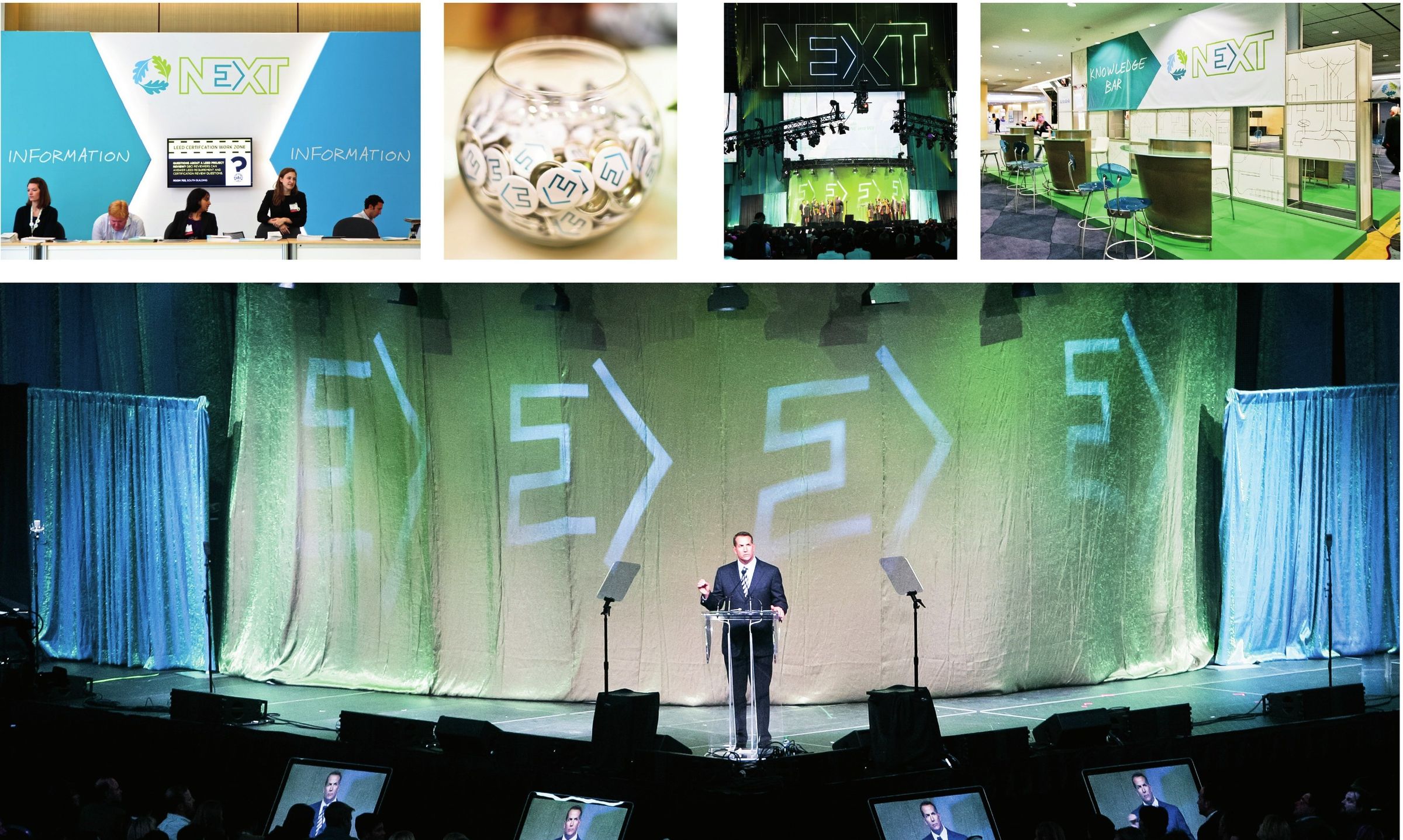
NEXT on site: displays and keynote stage, 2011
NEXT on site: displays and keynote stage, 2011. With Champion Exposition Services and Post Typography
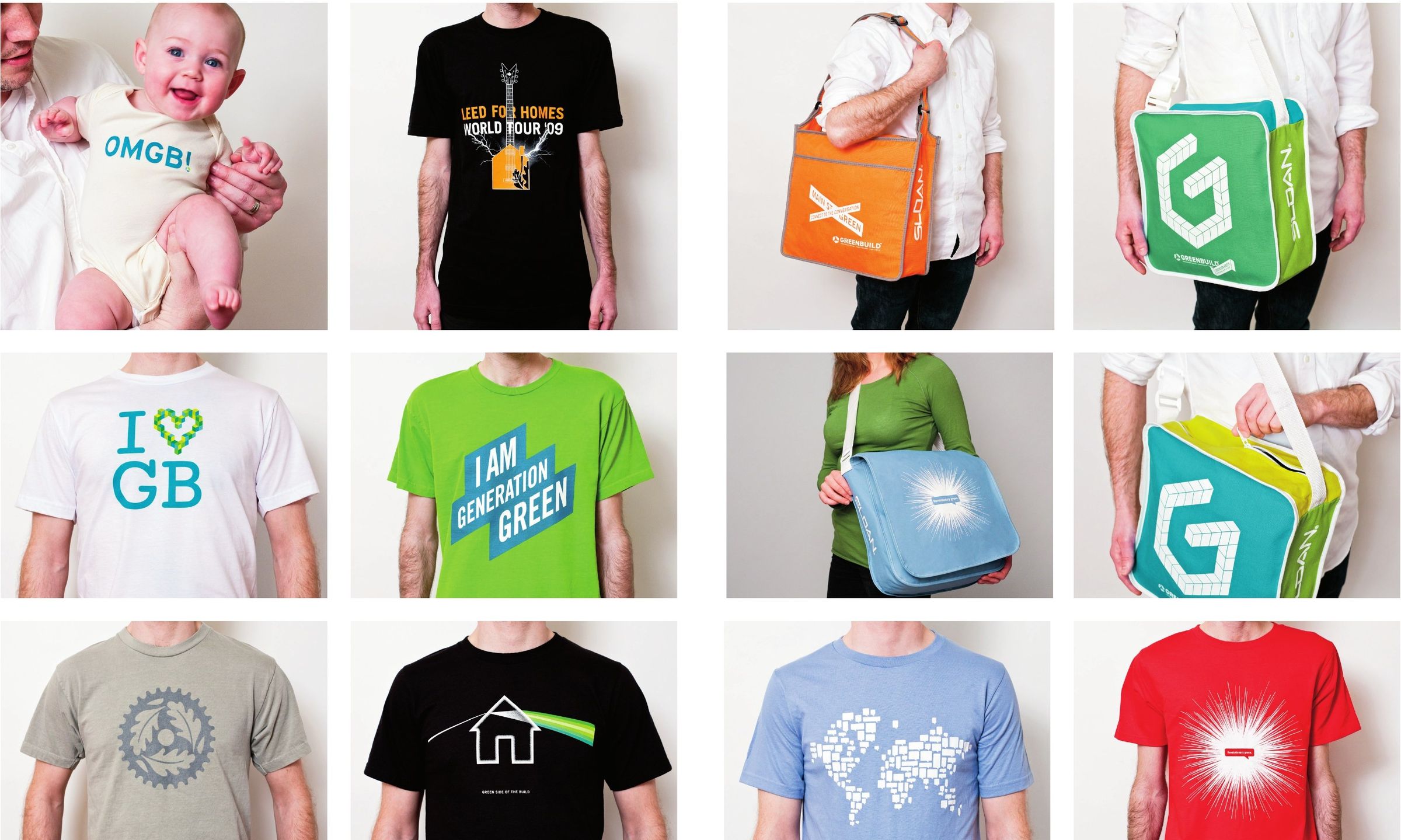
The movement, worn: T-shirts and conference bags, 2008–2010
The movement, worn: T-shirts and conference bags, 2008–2010. With Post Typography
Brand book back cover, 2011. Concept: Andre Poremski. Design: Post Typography

Thank you

This work grew through years of collaboration. In 2011, I created a book to thank the studios and designers who helped shape it: Post Typography, Doyle Partners, Shaw Jelveh Design, Modo Design Group, Green Plaque, Envision Design, Champion Exposition Services, Acorn Signs and Amy Hedgepeth.

Their individual perspectives made the work richer. My role was to give us a shared direction.

Brand book, 2011. Concept: Andre Poremski. Design: Post Typography.

← Back

Next

International WELL Building Institute

Head of Design​2022–Present

View next →